Relationship between letter shape and character impression using eye movement measurement: Japanese hiragana letter
Background Most of the studies that have investigated the relationship between letter shape and the letter impressions have used such evaluation methods as impression evaluations. It is possible to inspect impression changes quantitatively by shape the letter using an impression evaluation, but it is difficult to conduct a detailed examination where the letter elements affects the impression. Therefore, elements that affect the impression of Ming and Gothic styles are still unclear. Consequently, in this study we measure eye movements using an eye-tracking device on participants asked to evaluate letter impressions, and examine those elements that affect letter impressions. In particular, for hiragana letters of the Ming and Gothic styles, we measure eye movement fixation in term of duration and frequency when the participants evaluate those impression that can easily be affected by letter shape such as thickness, weight, adultness.
Methods We tested our method with 29 Japanese participants who varied in age from 20 to 30 years. We selected two characters, "つ" and "ほ", as letter simulations that show extreme differences in letter shape features such as the number of strokes and point of intersection in the 71 Japanese hiragana letters. We perform an impression evaluation of four types of letters using the Ming and Gothic styles for the aforementioned two characters. For this, we measure eye movement using an eye-tracking device. We attempt to inspect the results using an interview investigation.
Results For the Ming and Gothic-styles of "つ", the eye movement fixation duration is sufficiently long for the pressing down of the drafting department; we also measure, the frequency of eye movement fixations. For the Ming and Gothic styles of "ほ", an extended eye movement fixation duration is measured for the part that contains much information, such as the central part and curved section of the letter, and many eye movement fixations also occur. In addition, as a result of investigating the point on which participants focus when evaluating letter impressions, we find that this is similar to the results of the eye movement measurement experiment.
Conclusions We measure eye movement using an eye-tracking device to examine in greater detail the type of letter shape element that affects letter impressions when the participants evaluate such impressions in this study. From the results of this study, it is clear that eye movement measurement is an effective technique for investigating relationships that are more detailed than letter shape and letter impression. We believe that we can apply this technique when examining the relationship between letter shape and the impression of various letters, such as Korean, English, and the Japanese hiragana letters used in this study.
Keywords:
Font, Eye Movement, Impression Evaluation1. Introduction
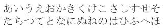
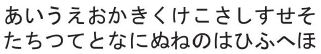
Letters are the media that is make it possible to communicate via visual letter shape (Shim et al., 1999). Therefore, letters can be printed using various fonts based on a specific purpose (e.g., feelings effect). Above all, Ming and Gothic styles are used to represent serif and sans serif fonts in various scenarios. As an example of letter shape characteristics (Washinosu, 2009), the Ming style, includes pressing down and a scale for the writing brush part, and a horizontal line that is thinner than a vertical line. In contrast, for the Gothic style, the writing brush part has a small decoration, such as pressing down or scale, and the line thickness is relatively even. The impression that we receive from molding changes based on a characteristic difference. For example, according to Honda et al. (2011), in the case of a Japanese hiragana letter (see Table 1), it becomes clear that the Ming style gives the impression of being thin, light, adult-like, where as the Gothic style gives the impression of being thick, heavy, childish. In addition, it is stated that letter impressions, such as thinness, lightness, adultness change based on the letter shape.

Example of Ming and Gothic styles for Japanese hiragana letters
Therefore, it is thought that the results on the relationship between letter impression and letter shape become useful data for improving communication accuracy through the visual shape of the letter. In particular, letter usability has been attracting attention in domains such as advertising. Consequently, we believe that such studies will be more common in the future. Most previous studies have used impression evaluations to investigate letter shape and letter impressions. This evaluation method can quantitatively inspect changes in the impressions for shape letters, but investigating the specific factor that affects letter impressions is difficult. Therefore, the factor that influences the impression of Ming and Gothic styles has not yet become clear. In particular, it is thought that examination of the above is necessary for realizing effective communication in today's society, where letter design based on the Ming and Gothic styles is becoming widespread.
In this study, we examine eye movements using an eye-tracking device on participants asked to evaluate letter impressions. Using this technique, it is possible to measure action indexes, such as duration and frequency, for eye movement fixations on an appointed part. According to previous studies, it is clear that there is a difference in the viewing frequency of information because humans tend to pay attention to necessary information when collecting it (Tawatsuji et al., 2013; Nagasawa & Moriguchi, 2002; Fuzii et al., 2016). In addition, it has been revealed that the viewing frequency of necessary information increases more than for unnecessary information.
Thus, it is clear that the viewing duration and frequency of the required information increases, proportionally to the acquired information quantity (Aoki & Itoh, 2002). Using an eye-tracking device, Choi et al. (2010, 2012) examined viewing duration as people selected a product in order to clarify the factor that affects impression from the item listed on packages, such as a canned coffee or over-the-counter pharmaceutical products. Aoki & Itoh (2000) also used an eye-tracking device to examine viewing duration for television advertisements in order to determine the attraction points when consumers evaluated an impression from such television advertisement. From these, it is thought that experiment method that use eye-tracking devices are effective for examining those elements that affect letter impressions.
Based on these studies, we use an eye-tracking device to determine the factors that affect the impression of each font used in this study. In particular, we measure the duration and frequency of eye movement fixations of participants asked to evaluate (thinness, lightness, adultness) the Ming and Gothic styles of hiragana letters. It is impression easily affected by letter shape, such as thinness, lightness, adultness. Furthermore, we compared changes in viewing duration and frequency between the Ming and Gothic styles.
2. Method
2. 1. Participants
We performed an experiment with 29 Japanese individuals who varied in age from 20 to 30 years (16male, 13female, average age 23 years) from December 2014 to January 2015.
2. 2. Simulation
We selected two characters from the 71hiragana letters and tested them for this study. A hiragana letter has few strokes without intersection, such as "つ", and many strokes with intersections, such as "ほ".From previous studies, it has been clear that the eyes concentrate on a particular section when a person reads a letter; such area of concentration contains much information, such as the intersection of strokes (Kohama et al., 1994; Watanabe & Saruta, 2002). Therefore, we expect the part where the eyes concentrate to be influenced by differences in structure, such as the number of strokes and whether there is an intersection. In addition, "つ" and "ほ" have the high curvilinearity that characterizes hiragana letters, and thus we selected them because they have a roundness degree level that is higher than for the other letters of the same structure (Komatsu et al. 2014). We also selected these two letters because their design properties are strong among 71 hiragana letters, and indicate an extreme difference in structure. We created four simulations for adding each letters to the Ming and Gothic styles (see Table 2). The size of the letter simulation is 110 × 110mm2 and does not process the letter thickness or color.
Letter simulation
2. 3. Adjective pair
Honda et al. (2011) studied the changes that font type make on impressions. Their study indicated that impressions, such as weight, adultness, beauty, thickness are affected by the font type. For this study, we selected three adjective pairs "thin–thick," "light–heavy," "childish–adult-like." These adjective pairs have clear differences on impressions made with the Ming and Gothic styles (Honda et al., 2011).
2. 4. Experimental device
We used a 24-in. LCD display (16:10 wide screen, 1,920 × 1,200 dpi) to present simulations of the letters "つ" and "ほ"(see Figure 1). We installed a chin rest 57cm away from the display and fixed the distance between the participant and display. In addition, we measured the participant’s eye movement as he/she observed the letter simulation using an XL20 eye tracker from the Tobii company. Furthermore, we set the laboratory’s illumination to approximately 1,000 lux.

Experiment scenery
2. 5. Experimental procedure
The experiment was performed while the participant was seated on a chair. Before conducting the experiment, the participants were given information with regard to the experiment’s content and were instructed to sign an agreement before joining the experiment. For this experiment, first, a red dot appeared in the middle of the letter simulation display for 1 s (see Figure 2). Subsequently, one of the three adjective pairs was displayed for 2 s. The purpose of displaying the adjective pair for 2 s is to provide the participants with information on the standards for evaluation. After 2 s, one of four types of letter simulations was displayed for 10 s. After 10 s, the adjective pair was displayed again at the bottom of the display. The participants then used a controlling mouse to evaluate their impressions on the letter simulation. The adjective pair was presented using Semantic Differential method.

Experiment flow
Participant was performed, using a combination of four types of letter simulations and three adjectives for a total of 12 trials. This experiment set the letter simulation and adjective pairs to be presented randomly in consideration of the potential effects of display order. Meanwhile, while executing the 12 trials, the movement of the participants’ eyes was measured using an eye-tracking device. Following the experiment, the participants were interviewed on what they focused while the letter simulation was presented on the display.
2. 6. Results of analysis method
As indicated in Section 2. 2, the eyes tend to concentrate more on those sections that contain much information when reading letters. (Kohama et al., 1994; Watanabe & Saruta, 2002; Komatsu et al., 2014). Those sections that contain much information, such as picture intersections or curves, were separated from those sections that do not contain much information in order to analyze whether such eye concentration trends could be recreated in our experiment. In addition, because of the predictions that differences in terms of pressed strokes and design scales between the Ming and Gothic styles could affect the participants’ impressions, this study separated both factors for analysis. Based on this standard of the two aforementioned factors, the results are analyzed considering that "つ" has 4 divisions (T1 to T4), whereas "ほ" has 11 divisions (H1 to H11) (see Figure 3). Moreover, the eye movement is considered fixed if it remains on each part of the letter for longer than 0.3 s.

Letter divisions
3. Results
3. 1. Duration of eye movement fixation
Figure 4 shows the eye movement duration when fixed for "つ" simulated in both the Ming and Gothic style’s in each evaluation pair. The results show that "つ" in the Ming style has the longest duration of eye movement fixation in the order of T2, T1, T4, and T3. After performing a variance analysis(repetitive measurement) on the duration of eye movement fixation in each part of T1 to T4 under each evaluation pair, no statistical significance was confirmed, and the duration of eye movement fixation on each pair of T1 to T4 has a similar result (T1: F[2, 56]=0.12, P>0.05), (T2: F[2, 56]=0.24, P>0.05), (T3: F[2, 56]=0.10, P>0.05), (T4: F[2, 56]=0.28, P>0.05).

Duration of eye movement fixation on three adjective pairs of "つ" in Ming and Gothic styles
"つ" in the Gothic style also has the longest duration of eye movement fixation in the order of T2, T1, T4, and T3, similar to "つ" in the Ming style. After performing a variance analysis(repetitive measurement) on the duration of eye movement fixation in each part of T1 to T4 under each evaluation pair, a statistical significance was confirmed for T2 (F[2, 56]=3.13, P<0.05) and T4 (F[2, 56]=3.87, P<0.05). In addition, after performing Bonferroni’s multiple comparisons, T2 shows a longer duration while evaluating the adjective pair “childish–adult-like,” whereas T4 shows shorter duration (P<0.05). To examine this result in detail, a correlation analysis that uses the duration of eye movement fixation for T2 and T4 confirms a medium negative correlation (y=0.43, P<0.05).
Meanwhile, comparisons between "つ" in the Ming and Gothic styles show that the duration of eye movement fixation at T3 is longer for "つ" in the Ming style than "つ" in the Gothic style when evaluating “childish–adult-like” and “light–heavy” (P<0.05). Contrary to this, the duration of eye movement fixation at T4 is longer for "つ" in the Gothic style than "つ" in the Ming style when evaluating “light–heavy” (P<0.05).
Figure 5 shows the eye movement duration when fixed for "ほ" simulated in both the Ming and Gothic styles in each evaluation pair. The results show that "ほ" in the Ming style has few differences in the duration of eye movement fixation, but the longer duration was in the order of H8, H10, H2, H3, H5 and H1, H7. After performing a variance analysis(repetitive measurement) on the duration of eye movement fixation in each part of H1 to H11 under each evaluation pair, a major statistical significance is confirmed for H3 (F[2, 56]=7.51, P<0.01) and H8 (F[2, 56]=3.05, P<0.05). In addition, after performing Bonferroni’s multiple comparisons, H3 shows longer during while evaluating the adjective pair “light–Heavy,” whereas H8 shows shorter duration (P<0.05). To examine this result in detail, a correlation analysis that uses the duration of eye movement fixation for H3 and H8 confirms a light negative correlation (y=0.38, P<0.05).

Duration of eye movement fixation on three adjective pairs of "ほ" in Ming and Gothic styles
"ほ" in the Gothic style also has few differences in the duration of eye movement fixation, but the longest duration was mainly in the order of H10, H8, H2, H5, H1, and H3, H4, H7. After performing a variance analysis (repetitive measurement) on the duration of eye movement fixation in each part of H1 to H11 under each evaluation pair, a statistical significance is confirmed on H5 (F[2, 56]=4.47, P<0.05).
In addition, after performing Bonferroni’s multiple comparisons, H5 shows longer duration while evaluating the adjective pair “childish–adult-like” than for “thin–thick” (P<0.05).
Meanwhile, the comparisons between "ほ" in the Ming and Gothic styles show that, under each evaluation pair, "ほ" in the Gothic style has longer duration of eye movement fixation in H2 and H3 than "ほ" in the Ming style (P<0.05). Furthermore, "ほ" in the Ming style at H8 has longer duration of eye movement fixation on “childish–Adult-like” and “thin– thick.” Contrary to this, at H10, "ほ" in the Gothic style has longer duration of eye movement fixation(P <0.05).
3. 2. Frequency of eye movement fixation
Figure 6 shows the average frequency of eye movement fixation on each part of the font and evaluation pair on “つ”. In the Ming style, regardless of other evaluation pairs, T1 and T2 show the most frequent eye movement fixation. After performing a variance analysis (repetitive measurement) on the frequency of eye movement fixation at T1 to T4, no statistical significance is confirmed, and the frequency of eye movement fixation on each evaluation pair at T1 to T4 shows a similar result (T1: F[2, 56]=2.02, P>0.05), (T2: F[2, 56]=0.28, P>0.05), (T3: F[2, 56]=0.50, P>0.05), (T4: F[2, 56]=0.74, P>0.05).

Frequency of eye movement fixation on three adjective pairs of “つ” in Ming and Gothic styles
T1 and T2 show the most frequent eye movement fixation in the evaluation of “childish–adultlike” and “thin–thick” in the Gothic style. However, the evaluation of “light–heavy” does not show any differences in the frequency of eye movement fixation. After performing a variance analysis (repetitive measurement) for each eye movement fixation at T1 to T4, T2 (F[2, 56]=3.67, P<0.05), T3 (F[2, 56]=3.55, P<0.05), and T4 (F[2, 56]=4.79, P<0.05) show major statistical significance. In addition, after performing Bonferroni’s multiple comparisons, the frequency of eye movement fixation at T2 is greater in the evaluation of “childish–adultlike” than that of “light–heavy” (P<0.05), and the frequency at T3 is greater than “thin– thick” (P<0.05). In addition, T4 shows the most frequent eye movement fixation than other evaluation pairs when evaluating “thin–thick” (P<0.05).
Meanwhile, the comparison between “つ” in the Ming and Gothic styles show that, while evaluating “childish–adult-like,” the frequency in Gothic style is greater than in the Ming style at T3 and T4 (P<0.05). In addition, at “light–heavy,” the Gothic style has greater frequency than the Ming style at T3 and T4 (P<0.05), and the Ming style has the greatest frequency at T1 (P<0.05).
Figure 7 shows the average frequency of eye movement fixation on each part of the font and evaluation pair on “ほ”. In the Ming style, H1, H3, H5, H7, H8, and H10 have the greatest frequency of eye movement fixation. After performing a variance analysis (repetitive measurement) on the frequency of eye movement fixation at H1 to H11, a statistical significance is confirmed on H2 (F[2, 56]=13.27, P<0.01), H5 (F[2, 56]=4.51, P<0.05), and H7 (F[2, 56]=8.15, P<0.01). In addition, after performing Bonferroni’s multiple comparisons, the frequency of eye movement fixation at H2 is greater in the evaluation of “thin–thick” than that of “childish–adult-like,” and “light–heavy” (P<0.05). Contrary to this, the frequency of eye movement fixation at H5, H7 is the least than any other evaluation pairs (P<0.05).

Frequency of eye movement fixation on three adjective pairs of "ほ" in Ming and Gothic styles
The Gothic style at H1, H3, H5, H8, and H10 shows the greatest frequency of eye movement fixation. After performing a variance analysis (repetitive measurement) for each eye movement fixation at H1 to H11, H1 (F[2, 56]=21.10, P<0.01), H2 (F[2, 56]=6.04), P<0.01), H7 (F[2, 56]=8.91, P<0.01), H8 (F[2, 56]=9.57, P<0.01), and H10 (F[2, 56]=7.65, P<0.01) show statistical significance. In addition, after performing Bonferroni’s multiple comparisons, the frequency of eye movement fixation at H1, H8, and H10 on the evaluation of “light–heavy” is greater than the other pairs (P<0.05). Moreover, while evaluating “thin–thick,” H2 shows the least frequency of eye movement fixation of all other pairs (P<0.05). Furthermore, while evaluating “childish–adult-like,” H7 shows the least frequency of eye movement fixation of all other pairs (P<0.05).
Meanwhile, the comparison between "ほ" in the Ming and Gothic styles shows that the frequency of eye movement fixation at H8 is the same as the average frequency of each pair, and "ほ" in the Gothic style has a greater frequency of eye movement fixation than "ほ" in the Ming style.
3. 3. Evaluation on impression
The average estimation on each pair derived from this study is 「1.00-1.99: Very (left on adjective pairs)」, 「2.00-2.99: Quite (left on adjective pairs)」, 「3.00-3.99: Slight (left on adjective pairs) 」, 「4.00: Nowhere」, 「4.01-5.00: Slight (right on adjective pairs)」, 「5.01-6.00: Quite (right on adjective pairs)」, and「6.01-7.00: Very (right on adjective pairs)」. The results show that “つ” and “ほ” in the Ming style are assessed to be quite adult-like, light, and thin (see Figure 8). Contrary to this, “つ” and “ほ” in the Gothic style are assessed to be slightly childish, heavy, and thick. After comparing the average estimation on the three adjective pairs for both the Ming and Gothic styles, a statistically significant difference is obtained (P<0.01).

Average estimation for each letter impression
3. 4. Interview investigation
According to the interview investigation on impressions, all participants, regardless of font, responded that they focused on H1 and H2 while looking at “つ”, and 24% answered that they also focused on H4. All the participants indicated that they focused on H8 and H10 in the Ming style, and 66% also focused on H3 while looking at “ほ”. Compared with this, all the participants responded with H10 in the Gothic style, and 89% indicated that they also focused on H8.
4. Discussion
This study used an eye-tracking device to measure eye movement while evaluating letter impressions. The result show that for “つ”, T1 and T2 were observed for a extended duration in both the Ming and Gothic styles. In addition, the fact that the interview investigation also obtained the same results indicates that, when evaluating impressions on “つ”, the eye movement focuses on the first few divisions where one presses down to write the letter. On the other hand, for “ほ”, H8 and H10 were observed longer for both the Ming and Gothic styles, and had a greater frequency of eye movement fixation. Moreover, the fact that the interview investigation also obtained the same results indicates that, when evaluating impressions on “ほ”, the eye movement is focused on the divisions where there is much information, such as the center of the letter or curves. As indicated in the introduction, when presented with much information, people tend to select that information they believe to be necessary and focus on it (Tawatsuji et al., 2013; Nagasawa & Moriguchi, 2002; Fuzii et al., 2016). Furthermore, when evaluating letters, the frequency of eye movement fixed on some parts of the letter increases as the participants compare the information deemed necessary with the information not deemed necessary (Aoki & Itoh, 2002). The results from this experiment confirm such trends, and find that, the eye movement fixes on those parts that require evaluating of the letter impressions.
Meanwhile, the results from this experiment found differences in the duration and frequency of eye movement fixation as evaluations were conducted on the impressions. In the case of “つ” in the Gothic style, there was no difference in the frequency of eye movement fixed on every part while evaluating weight, but when adultness and thickness were evaluated, T1 and T2 were observed more often than T3 and T4. Even if the time dedicated to observing T3 and T4 when evaluating weight was slightly shorter, increasing the frequency of eye movement fixed on those two divisions, as also occurred with T1 and T2, allowed evaluation on the impressions from the entire letter. On the other hand, in the case of “ほ”, both the Ming and Gothic styles showed differences in the duration and frequency of eye movement fixation. For the Ming style, H8 showed shorter duration of focused eye movement while evaluating weight, but H3 had a longer duration compared with the other evaluation pairs. Because of this, a relatively stable trend was found in H2, H3, H5, H8, and H10 without any noticeable differences in the duration of eye movement fixation. In addition, based on the fact that the same trend was observed with the frequency of eye movement fixation, we consider that weight is evaluated while assessing the impressions on the entire letter after comparison with the other letter divisions. At the same time, the interview results show that 66% of the participants focused on H3 while evaluating the impressions, which leads to inferences that the impact scale for H3 differs according to the adjective pairs. Compared with this, when evaluating adultness and thickness, H8 received longer focus than with any of the other adjective pairs. Such trends also occurred repeatedly in the Gothic style, and regardless of the adjective pairs, H8 and H10 had the longest duration of eye movement fixation. In addition, based on the fact that the frequency of fixed eye movement increased, H8 and H10 are believed to have a greater impact on the impressions in the Gothic style.
Meanwhile, while evaluating “ほ” in the Gothic style, frequency of fixed eye movement increased when weight was evaluated. This is similar to evaluating weight on “つ” in the Gothic style, and for the same reason, in the case of assessing “ほ” in the Gothic style, we consider that weight is evaluated while assessing the impressions on the entire letter.
This experiment also compared the Ming and Gothic styles in order to review the relationship between letter shape and impressions. The results show that for “つ”, the time dedicated to observing the letter divisions is the same for all divisions, the frequency with which the participants focused on H3 and H4 was longer for the Gothic style than for the Ming style. This evidence provides information that, in the case of “つ” in the Ming style, the divisions with strong shape characteristics receive more focus; however, for the Gothic style, which has few strong shape characteristics compared with the Ming style, the eye movement is dispersed throughout the letter. “ほ” showed the same trend as “つ”, and for the Ming style, the eye movement focused on the vertical parts on the left, which have strong shape characteristics. Compared with this, for “ほ” in the Gothic style, the vertical parts on the left did not receive as much focus as the Ming style because the former does not have strong shape characteristics, the eye movement was fixed on those parts with plenty of information, such as the intersection of strokes and curves.
From the previous results, we can see that the method for evaluating letter impressions differs because the fonts are distinct from each other. From such different evaluation methods, we conclude that the Ming style is considered to be adult-like, light, and thin, whereas the Gothic style is considered to be childish, heavy, and thick.
5. Conclusion
Our results measured eye movement while evaluating letter impressions using an eyetracking device; we also added a review on the factors that affect the aforementioned impressions. In addition, a comparison between the results derived from the experiment with the device and those obtained from an interview investigation verified the conclusion. Our experiment, could clarify the method for evaluating letter impressions. Thanks to this, the results from this study are expected to be useful for developing new fonts for a more effective transfer of information and images. In particular, as mentioned in the introduction, considering that both the Ming style lightly changes letter shapes for purpose and the Gothic style is used for many letter designs in order to facilitate effective communication, the results of the study seem to be very effective.
Furthermore, by adding eye movement measurements while evaluating letter impressions, we could not only review such impressions, but also determine the parts of the letter that had an impact on the impressions, which is useful method for adding a review on the relationship between letter shape and impressions. From this reason, various letters such as Korean, English, and hiragana in Japanese could be applied to measure the relationship between the shape of such letters and their impressions.
Acknowledgments
This work was done by JSPS KAKENHI (2015, Grant-in-Aid for Scientific Research (A)) Grant Number JP26240024.
Notes
Copyright : This is an Open Access article distributed under the terms of the Creative Commons Attribution Non-Commercial License (http://creativecommons.org/licenses/by-nc/3.0/), which permits unrestricted educational and non-commercial use, provided the original work is properly cited.
References
- Aoki, H., & Itoh, K. (2002). Analysis of Effect of Television Commercials on Information Acquisition Quantity and Strategy in Reading Printed Advertisements. Japan Industrial Management Association, 53 (5), 397-409.
-
Aoki, H., & Itoh, K. (2000). Cognitive attitudes to television commercials based on eye tracking analysis combined with scenario description. Japan Ergonomics Society, 36 (5), 239-253.
[https://doi.org/10.5100/jje.36.239]

- Choi, J., So, M., Koyama, S., & Hibino, H. (2010). The Evaluation of the Package Design Using Eyetracker and Change-blindness Paradigm: A Case Study of Packages of Japanese Canned Coffee Beverages. Bulletin of JSSD, 57 (3), 61-68.
- Choi, J., Koyama, S., Izumisawa, M., Shiragami, M., & Hibino, H. (2012). Guiding Consumers' Attention to Safety-Related Information by Highlighting "Risk Classification" on OTC Drug Packaging. Bulletin of JSSD, 59 (4), 11-18.
- Fuzii, H., Miyahara, T., Okamoto, T., Takaoka, H., Nishimatsu, T., & Kanai, H. (2016). Effects of Fabric Fragrance on Impression of Living Room. The Japan Research Association for Textile End-Uses, 57 (3), 205-214.
- Honda, T., Hirose, N., & Mori, S. (2011). Changes of affective properties of Japanese characters with their color-font combinations. IEICE Human Information Processing, 111 (60), 127-132.
- Kohama, T., Hatano, T., Saitoh, T., & Yoshida, T. (1994). An analysis of eye movements on character recognition. IEICE Image Engineering, 94 (96), 9-16.
- Komatsu, T., Nakamura, S., & Suzuki, M. (2014). "Don't you think Hiragana is rounder than Katakana?”: Availabilities of Mathematical Representations of Characters and its Curvature. SIG Human-Computer Interaction, IPSJ, 2014-HCI-159(7), 1-9.
- Nagasawa, S., & Moriguchi, T. (2002). A Possibility of Estimation of The Degree of Interest by Eye Movement: Based on the interviews to the specialists of eyeball movement. Social systems, 5 , 73-93.
- Shim, E., Miyazaki, M., & Noguchi, K. (1999). Depth Expression of Printed Letters: Through Comparison of Image Assessment between Japan and Korea. Bulletin of JSSD, 46 (1), 47-54.
- Tawatsuji, Y., Muramatsu, K., Kojima, K., & Matsui, T. (2013). Proposal of the Model for the Uncanny Valley Based on the Dual-Pathway of Emotion and the Hippocampus. IEICE Human Communication Science, 113 (185), 39-44.
- Washinosu, T. (2009). Universal Design of Characters: Development of Japanese Character Fonts from the Viewpoint of Universal Design. The Japanese Society of Printing Science and Technology, 46 (3), 131-136.
- Watanabe, Y., & Saruta, K, (2002). Eye movement in the recognition of handwritten Kanji characters: A study with the inverse stimulus presentation. IEICE Human Information Processing, 102 (534), 37-41.