Thai Typefaces (Part 2): Criticism Based on Legibility Test of Some Isolated Characters
Background According to the assumptions of our previous study, we qualitatively tested the tolerance of Thai characters under blurred conditions, Gaussian blur. Firstly, we used the fifty Thai conventional text fonts in the boundary of ‘The Table of Thai Character's Relationship’ in the same character heights as stimuli. The stimuli simulated the visual acuity of people with poor vision at different blur levels. This study was conducted to prove the assumptions of the previous study based on quantitative research, as a pilot study.
Methods We chose some characters which were expected to have advantages and disadvantages regarding visibility and legibility. The selected characters were subjected to blurred conditions and administered to participants for investigating the case of Thai legibility.
Results We found the simulated conditions revealed many problems on the visibility and the legibility matters of Thai characters; however, these findings led to ideas and possible solutions, which may provide assistance for the approach to designing a Thai typeface that has high legibility and visibility.
Conclusions In order to improve some Thai characters with high legibility and visibility, the key features may be involved to 5 features that should be considered to develop Thai UD Typeface consist of; 1) type anatomy; 2) character width; 3) character shape; 4) stroke shapes and; 5) terminal aspect.
Keywords:
Thai Typeface, Isolated Letters, Visibility, Legibility, Recogniz Ability, Letter Feature, Blurring Test1. Introduction
According to the first part study (Punsongserm et al., 2017), we mentioned that qualitative research studies may be an effective way for preliminary surveying and establishing some hypotheses, leading to further research. However, quantitative research has provided reliable, perspicuous results the disadvantage of this focus may be an inability to conduct comparative tests using several fonts simultaneously.
The aim of this study, as quantitative research, was to examine some isolated characters that have been noted as the assumptions on visibility and legibility problems, in the first part study, under simulated conditions of low visual acuity, with blurred characters.
For conception concerning Thai letter, the same literatures have been needed for this article, 'Unicode Standard' (Thai, 2015), 'The Thai System of Writing' (Hass, 1956), and 'Thai and Lao Writing' (Diller in Daniels & Bright, 1996).
Although, in current, most of the typical legibility test often is conducted with computer screen, for instance, the study of Nakano et al. (2010) and Arai et al. (2011) that used simulated condition of low vision via a wide view ground glass filter, and Hakamada et al. (2011) used pseudo-cataract experience goggles.
However, in order to comply with the first part study, we still chose to use the computer software for simulation of blurred vision and conducted data collection via a paper-based study.
2. Methods
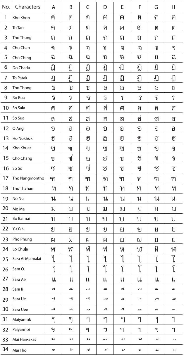
From the initial study (Punsongserm et al., 2017), thirty-four characters were criticized for their visibility and legibility problems. The same characters of Bo Baimai height 2.5 mm were compared between fifty typefaces (Figure 1, the upper part illustrates the characters without the blur simulation, and the lower part illustrates with the blur simulation, blur level 1.74 mm). After that we considered to choose the eight type characteristics out of the fifty type characteristics for investigating legibility of Thai typefaces, two hundred seventy-two characters, see Table 1 for detail.

An example of the same characters were compared between fifty typefaces, characters Ho Nokhuk

The thirty-four typefaces with the varied eight of type characteristics, Bo Baimai height 2.5 mm
2. 1. Stimulus Characters
The selected characters, Bo Baimai height 2.5 mm, were randomized and separated to become two sets, of one hundred thirty-six per set. Each character set was placed into a horizontal grid, which includes blank spaces measuring 240 x 170mm within the boundary of A4 sheets (two sheets). All characters were black on white background. We produced two sets of blur levels for the two sheets mentioned above, with two sheets for blur level 1.74 mm (first set, 272 characters) and two sheets for blur level 1.04 mm (second set, 272 characters). The test sheets were printed onto uncoated paper using a laser printer, in grayscale-resolution 300 dpi.
2. 2. Apparatus
We used a 90cm x 120cm Mastex drafting table that was set at a 30 degree slope, standing 60cm of height out of floor-to-base lower rim and 60cm for an upper rim. A lamp with a light bulb (Philips Practitone Daylight Blue 60 watts) was installed at the upper-left corner of the table. The lamp head was turned onto the center of the table which is the area for the placement of the test sheets. The distance between the light bulb to the test area measured 45cm. The area of testing sheets was measured in illuminance by a light meter, SEKONIC Flash Master L-358, and was set with illuminance as 450 lx (7.5 EV). A drafting chair, Mastex DC-3, set at 55cm of height from floor to base of the seat, was used with the table, together as a set.
2. 3. Participants
Thirty-five Thai students from the Thammasat University Lampang Center participated and were paid 100 Baht for completing the tested sheets. The participants were between the ages of 19 and 24, and had normal or corrected-to-normal visual acuity.
2. 4. Procedure
The experiment was conducted in a dark room. Each participant took around ten minutes to adjust to the dark (dark adaptation). The participants were instructed to begin with the first set of stimulus followed by the second set, sitting down on the drafting chair, under the conditions of the prepared apparatuses. The participants perceived each character and then specified the perceived letters by writing them down into the blank spaces on the right side of each row, first with the single letter and then the extended word for each, such as /ช.ช้าง/, /ม.มา้ /, /ย.ยกั ษ/์ and so on. The distance of viewing the characters was approximately 40cm, the visual angle was 0.3575.
3. Results and Discussion
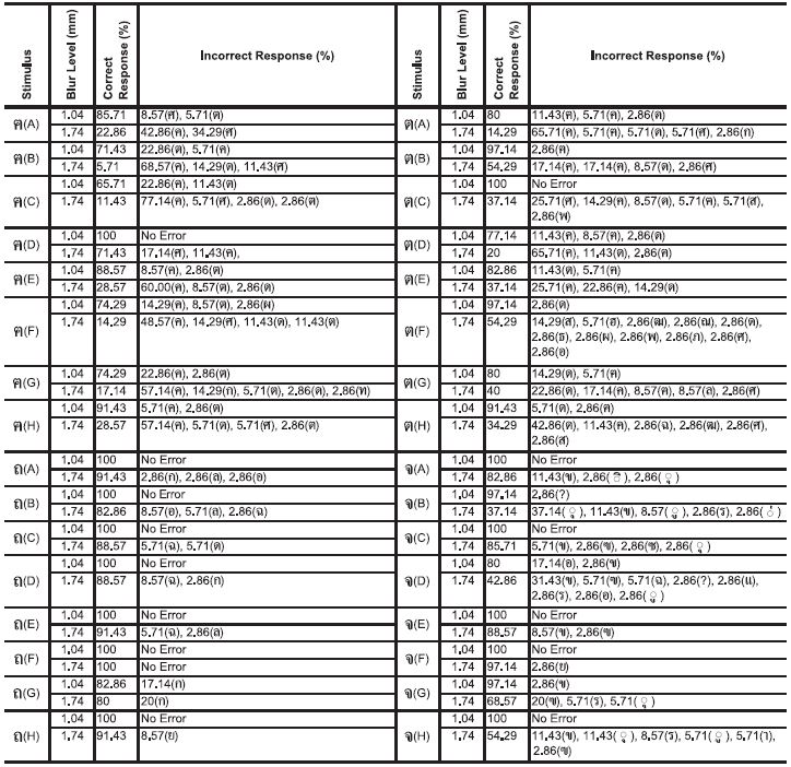
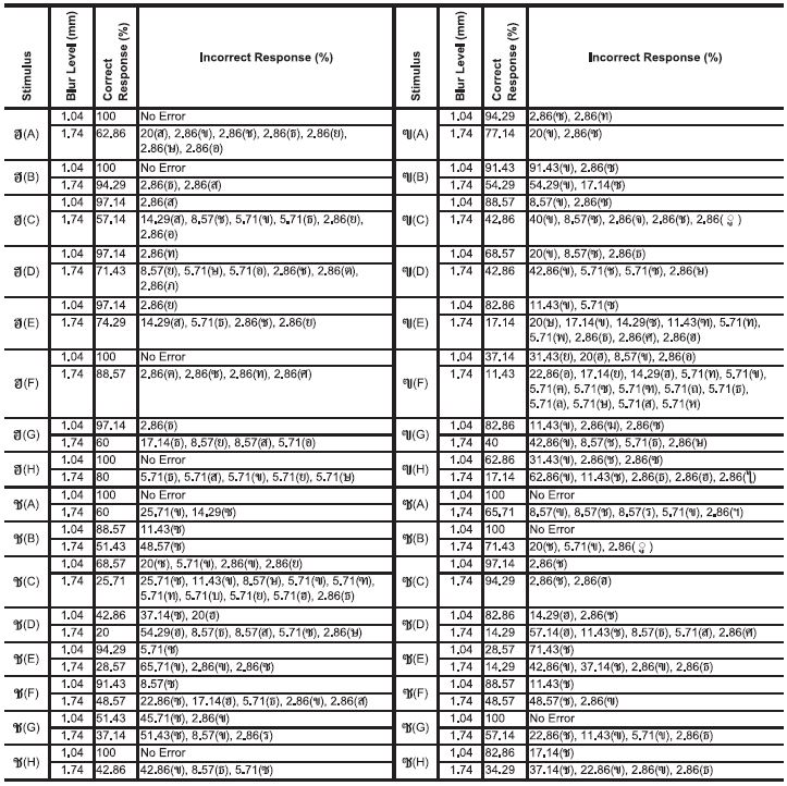
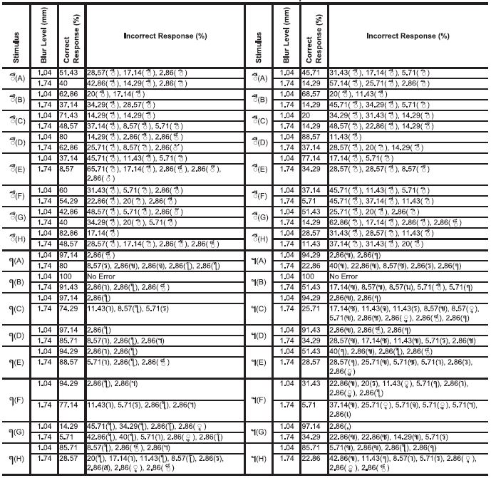
3. 1. The Character /ฅ/ (Kho Khon)
Table 2 (a group of upper-left): Most of the characters were perceived as the confused pairs to letter /ค/ (Kho Khwai) as well as /ต/ (To Tao), /ศ/ (So Sala), /ด/ (Do Dek). The characters /ฅ(B)/ and /ฅ(C)/ show the highest percentages of incorrect responses, especially for letter /ค/ (Kho Khwai). On the other hand, character /ฅ(D)/ provides greater improved capability than the other characters, i.e. it has no error at blur level 1.04 mm, and blur level 1.74 mm still provides the correct response more so than other characters. If considered in terms of the type characteristics, the aspects that may assist for improving legibility of character /ฅ/ include the obviousness of its serrated line and first loop as well as increased character width. These aspects manifest in the character /ฅ(D)/, the increased character width supports improved visibility while it is blurred.
The response percentages of the characters /ฅ/, /ต/, /ถ/, and /จ/
3. 2. The Character /ต/ (To Tao)
Table 2 (a group of upper-right): At blur level 1.04 mm, each character becomes confused with the letters /ด/ (Do Dek), /ค/ (Kho Khwai), and /ศ/ (So Sala). The characters in blur level 1.74 mm, have a low percentage of correct responses, especially, the characters /ต(A)/ and /ต(D)/. The most frequently confused pairs were /ค/ (Kho Khwai) and /ด/ (Do Dek) respectively, and involve letters /ศ/ (So Sala) and /ส/ (So Sua). Although both characters /ต(B)/ and /ต(F)/ have the highest percentage, they have fewer correct responses for each. In order to improve character /ต/, increasing the size of its serrated line, using a lower joint for a front stem, and a diagonal line connecting to the first loop are a necessity. These changes seem to be and a better approach for creating more counter space. This is also the same case for the character /ฅ/ (Kho Khon), which is expected to, increase in character width.
3. 3. The Character /ถ/ (Tho Thung)
Table 2 (a group of lower-left): No errors were found at blur level 1.04 mm. At the blur level 1.74 mm, each character still has a high percentage of correct responses. Character /ถ(F)/ had no errors, however, due to being confused as letter /ก/ (Kho Kai), character /ถ(G)/ encountered the highest rate of error. Also, the letters /ล/ (Lo Ling), /อ/ (O Ang), /ฉ/ (Cho Ching), /ด/ (Do Dek), and /ย/ (Yo Yak) are found just slightly in the others characters. This finding may be explained by the observation of the same upper line in each letter, i.e. the letters /ล/ (Lo Ling), /อ/ (O Ang), / ฉ/ (Cho Ching), /ด/ (Do Dek) have an upper line like letter /ก/ (Kho Kai). This similarity causes problems for identifying the letter. Incidentally, as a suggestion, the character /ถ/ ought to have a great loop and a wider character width than the characters /ก/ (Kho Kai) and /ภ/ (Pho Samphao).
3. 4. The Character /จ/ (Cho Chan)
Table 2 (a group of lower-right): Of the preferable letterforms, character /จ(E)/ is desirable, the character /จ(C)/ is quite acceptable because the aperture is nice and wide. Meanwhile, the character /จ(F)/ displayed more visibility within a counter than any other glyph and received the highest percentage of correct responses. Examples of unpreferable letterforms include /จ(D)/ which displays poor visibility due to its squeezed loop; and the character /จ(B)/ which has a counter space that is too small, which can cause it to be confused with the letter / ุ / (Sara U). Incidentally, most of the confused pairs are letter /ข/ (Kho Khai) whereas a confused pair as a letter /ฃ/ (Kho Khuat) is found in the finding of /จ(G)/ that may be caused by the existence of two vertical lines. Therefore, any letterform which consists of two diagonal lines, and only diagonal line as a line that connects with a vertical stem, may be an optimal approach.
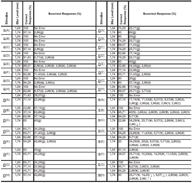
3. 5. The Character /ฉ/ (Cho Ching)
Table 3 (a group of upper-left): Generally, all characters show a preferable percentage of correct responses. There is no evidence in showing the confusion of letter /อ/ (O Ang) that we have noted (Punsongserm et al., 2017). Most confusion is seen with letter /ถ/ (Tho Thung). However, the emphasis of a large second loop that emerges out of a back stem line could assure more than other aspects, i.e. the character /ฉ(B)/. On the other hand, the characters /ฉ(F)/ and /ฉ(D)/ have camouflaged loops under their stems, causing confusion to letter /ถ/ (Tho Thung), the character /ฉ(H)/ with semi-second loop showing the confusion to letter /ถ/ (Tho Thung) as well.
3. 6. The Character /ฎ/ (Do Chada)
Table 3 (a group of upper-right): Visibility problems were found in most typefaces, which also contributed to an issue of legibility. For example, all characters are confused with letters /ฏ/ (To Patak), /ถ/ (Tho Thung), /ภ/ (Pho Samphao), /ธ/ (Tho Thong) and /ย/ (Yo Yak). It is noteworthy that the characters /ฎ(B)/, /ฎ(C)/, and /ฎ(D)/ have a higher percentage of correct responses due to having a wider aperture than the characters /ฎ(A)/ and /ฎ(E)/. Emphasizing the counter of the tail for character /ฎ/ in order to display its specific tail feature is our suggestion for resolving visibility issues.
The response percentages of the characters /ฉ/, /ฎ/, /ฏ/, and /ธ/
3. 7. The Character /ฏ/ (To Patak)
Table 3 (a group of lower-left): Astoundingly, all of the confused pairs show as letter /ฎ/ (Do Chada), yet some responses show as the letters /ถ/ (Tho Thung) and /ฐ/ (Tho Than). The diminutive serrated line of the characters /ฏ(B)/ and /ฏ(E)/ may be cause for more misperception, and is the difference from the clearer serrated line of the characters /ฏ(A)/ and /ฏ(G)/. Therefore, the serrated line in the tail of character /ฏ/ should receive clearer, more distinct emphasis in order to stand out, as opposed to merely emphasizing the counter of its tail. It is suggested that the long-tail-terminal of /ฏ(A)/ might assist with improved legibility as well.
3. 8. The Character /ธ/ (Tho Thong)
Table 3 (a group of lower-right): The character width is found to be too wide in the characters /ธ(E)/ and /ธ(F)/ and may be confused with other letterforms easily, such as /ฮ/ (Ho Nokhuk), /ถ/ (Tho Thung), /ล/ (Lo Ling) and so on. Narrow character width confuses this character with the letters that have the same character width, i.e. letters /ข/ (Kho Khai) and /ช/ (Cho Chang) from the finding of characters /ธ(C)/. The character /ธ(G)/ shows the highest percentage of correct responses. It reveals that the existence of the opened counter provides greater visibility than the closed counter, as well as a diagonal line that connects between a back stem and upper line. Furthermore, a horizontal upper line might assist to improve legibility more so than a flicked-up terminal and sagged terminal.
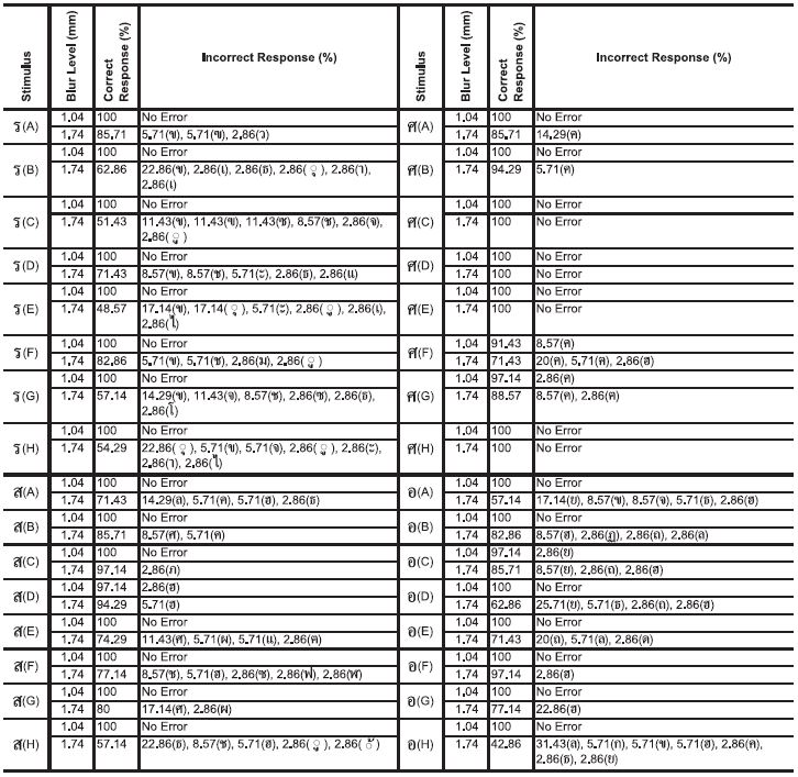
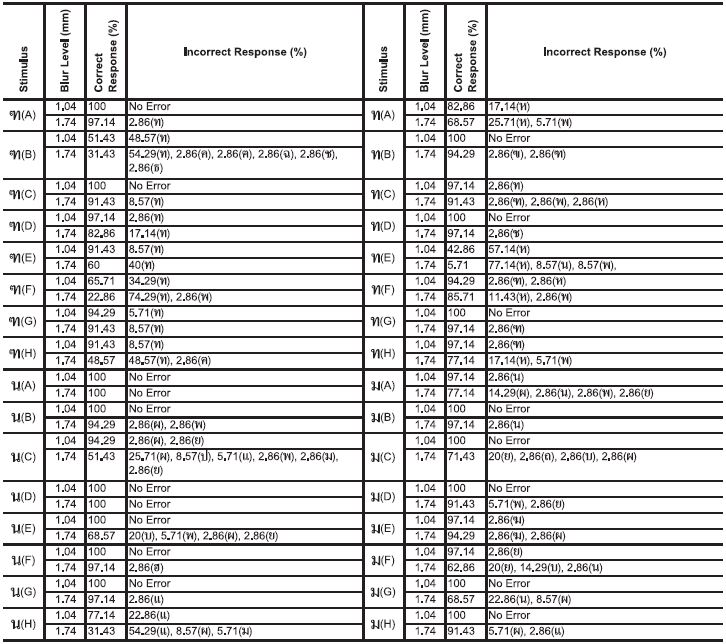
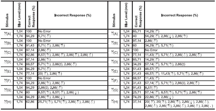
3. 9. The Character /ร/ (Ro Rua)
Table 4 (a group of upper-left): There are no errors at blur level 1.04 mm. However, at blur level 1.74 mm, the correct responses of some characters appear to decrease quite significantly, i.e. the characters /ร(E)/, /ร(C)/, /ร(H)/ and /ร(G)/. The wider characters, /ร(C)/ and /ร(G)/, confused as the letter group /ข/ (Kho Khai), include the letters /ฃ/ (Kho Khuat), /ซ/ (So So), /ช/ (Cho Chang) and so on. While mostly the narrow characters, /ร(H)/ and /ร(E)/, are confused as character / ุ / ( Sara U) which although both characters, /ร(H)/ and letter / ุ / (Sara U) have different sizes, they both have proportion for character width. However, the proper proportion for character /ร/ may be that of either character /ร(A)/ or character /ร(F)/ which resulted in the highest percentage of correct responses.
The response percentages of the characters /ร/, /ศ/, /ส/, and /อ/
3. 10. The Character /ศ/ (Sa Sala)
Table 4 (a group of upper-right): Almost all characters are resistant to the blurred conditions; particularly for the characters /ศ(C)/, /ศ(D)/, /ศ(E)/, and /ศ(H)/ which had no errors. However, a diminished tail in the character /ศ(F)/ can cause a decrease in legibility since it would look similar to and be confused with letter /ค/ (Kho Khwai) easily. Consequently, preserving the long tail is required for adequate legibility.
3. 11. The Character /ส/ (So Sua)
Table 4 (a group of lower-left): At blur level 1.04 mm, all characters have no errors, except for the character /ส(D)/ which received some incorrect responses (as letter /ฮ/ (Ho Nokhuk)). The best letterform is /ส(C)/ which has an added tail designed to jut out from the back of the stem, and a wide counter space. Only one participant did, in fact, perceive the character /ส(C)/ as letter /ภ/ (Pho Samphao).
Despite receiving a high amount of correct responses for the character /ส(B)/ which has quite a small counter space and includes the cross tail and falling down of its terminal, this glyph is similar to forms of the letters /ศ/ (So Sala) and /ค/ (Kho Khwai) resulting in a few incorrect responses for character /ส(B)/.
There is a rather low percentage of correct responses for the character /ส(H)/ due to its somewhat narrow character width and scanty upper counter space. These two aspects make this glyph resemble a form of letters /ธ/ (Tho Thong) or /ช/ (Cho Chang). In addition, the somewhat narrow character width and long tail of the character /ส(H)/ can cause confusion with any letter group that also has a tail and ascender, e.g. letter /ช/ (Cho Chang), /ฮ/ (Ho Nokhuk), /ซ/ (So So), /ฟ/ (Fo Fan), and /ฬ/ (Lo Chula). Definitely, the most incorrect responses were given to the character /ส(A)/ which has a short tail that was not designed to jut out from the back of the stem, making it easily confused as letter /ล/ (Lo Ling).
3. 12. The Character /อ/ (O Ang)
Table 4 (a group of lower-right): Almost no errors were noted for characters blurred at level 1.04 mm. The square form of the character, such as in /อ(H)/, has quite a high percentage of incorrect responses, especially being confused as letter /ล/ (Lo Ling). The character /อ(D)/ also had a high percentage of errors, mistaken as letter /ย/ (Yo Yak). On the other hand, almost no errors were discovered at level 1.74 mm blur when the form of the glyph takes on a circular form, as in character /อ(F)/. A key feature of character /อ(F)/ is its curved line which connects with its loop. This key feature is what differentiates it from the other characters (which all except for /อ(G)/ have a vertical line for connecting with the loop). The findings for the character /อ(G)/ show a percentage of errors concerning its confusion to only the letter /ฮ/ (Ho Nokhuk) (22.86%), while the character /อ(F)/ shows an error of just 2.86% (a one-time error). The difference in the number of errors of both findings might be due to a difference in the terminal of each character. The terminal of the character /อ(G)/ is short while the terminal of character /อ(F)/ is long and also falls down. Character /อ(F)/ results in fewer errors because its terminal is enhanced.
3. 13. The Character /ฮ/ (Ho Nokhuk)
Table 5 (a group of upper-left): There are slight errors found in the blurred characters of level 1.04 mm blur, as well as some characters that produced no errors. The highest percentage of correct responses were given to the character /ฮ(B)/, followed by the character /ฮ(F)/. Both are found in the same font set of the characters /อ(B)/ and /อ(F)/, respectively. The character /ฮ(B)/ has higher visibility within its counter since its coiled tail is reduced. However, improved legibility of the character /ฮ/ should be supported by an obvious loop, as well as a lower-curved line which will assist to distinguish it apart from letter /อ/ (O Ang) and letter /ส/ (So Sua). Character /ฮ(G)/ has a reduced coiled part similar to that of character /ฮ(B)/, but it was designed to refrain the first loop, resulting in a high percentage of incorrect responses (40%). At this point, the first loop for character /ฮ/ is most important in terms of visibility. In consideration of a lower-curved line versus a lower-horizontal line, using a lower-horizontal line for character /ฮ/ is likely to cause confusion to letter /ส/ (So Sua), as well as other characters which also use a lower-horizontal line (such as letters /ช/ (Cho Chang), /ข/ (Kho Khai), /ธ/ (Tho Thong), /ย/ (Yo Yak), /อ/ (O Ang) and so on), as the found in the characters /ฮ(A)/ and /ฮ(C)/.
3. 14. The Character /ฃ/ (Kho Khuat)
Table 5 (a group of upper-right): Each character had some amount of incorrect responses. Most of the confused pairs were with letter /ข/ (Kho Khai). Part of the loop with a serrated line, which was designed to squeeze (shrink) space of the character /ฃ/ (Kho Khuat) (including /ข/ (Kho Khai), /ช/ (Cho Chang), and /ซ/ (So So)) creates a problem when under blurred conditions. The evidence is apparent in the findings of characters /ฃ(F)/ and /ฃ(E)/, which have a wider character width, as well as character /ฃ(H)/, which has a narrow character width. These characters were given the most incorrect responses, and varied among confused pairs, i.e. the narrow characters were confused mainly with letter /ข/ (Kho Khai), while the wider characters were confused to groups of letters which have equal character width (such as letters /ษ/ (So Rusi), /อ/ (O Ang), /ย/ (Yo Yak), and so on). For the character /ฃ/ with a normal loop or jutted loop (e.g. the characters /ฃ(A)/, /ฃ(B)/, /ฃ(C)/, and /ฃ(D)/), each character received more correct responses than the characters /ฃ(E)/, /ฃ(F)/, and /ฃ(H)/. It seems that the character /ฃ(A)/ may be the most optimal letterform. However, for improving the character /ฃ/, reducing the significance of the first loop and enhancing its serrated line are necessary.
The response percentages of the characters /ฮ/, /ฃ/, /ช/, and /ซ/
3. 15. The Character /ช/ (Cho Chang)
Table 5 (a group of lower-left): The most frequent incorrect responses given to this character were letters /ซ/ (So So) and /ข/ (Kho Khai). The characters /ช(A)/ and /ช(H)/ had no errors at blur level 1.04 mm. The characters /ช(E)/, /ช(F)/ and /ช(B)/ also received a desirable amount of correct responses. However, at blur level 1.74 mm, the percentages of correct responses for each character decreased. From the results, it may be analyzed that there are three factors which are important for identification. These factors include a first loop, a diagonal tail, and the character width. A narrow character with a normal length of tail and a large loop, as in /ช(G)/, results in numerous confused pairs as letter /ซ/. The narrow character width, short tail and squeezed loop of characters /ช(E)/ and /ช(H)/ reveal numerous confused pairs as letter /ข/ (Kho Khai). The character with a larger width and a squeezed loop, as in the character /ช(C)/, results in confusion with the letter /ซ/ (So So) as well as other characters that have wide character width. The character /ช(D)/ is mainly confused as both letters /ฮ/ (Ho Nokhuk) and /ซ/ (So So). The reason character /ช(D)/ has a high frequency of confusion to letter /ฮ/ (Ho Nokhuk) may be due to the existence of a lower-curved line and wide character width, which is similar to the form of the letters /ฮ/ (Ho Nokhuk) and /อ/ (O Ang). It is possible that the letterform for character /ช(A)/ is the best out of the group, although it still has quite a great number of errors as confused pairs with /ข/ (Kho Khai) and /ซ/ (So So). Even though character /ช(B)/ has a massive, long tail, findings at both level 1.04 mm and level 1.74 mm show it confused with letter /ซ/ (So So). This may be a good reason for reducing and minimizing the appearance of the first loop.
3. 16. The Character /ซ/ (So So)
Table 5 (a group of lower-right): Other than the wide character width of /ซ(D)/, all characters were mostly confused with the letters /ช/ (Cho Chang) and /ข/ (Kho Khai). Because of character /ซ(D)/’s width, it was more commonly confused as letter /ฮ/ (Ho Nokhuk) (57.14%). The character /ซ(E)/ shows the lowest percentage of correct responses for both blur level 1.04 mm and level 1.74 mm. The character /ซ(E)/ is commonly mistaken as letters /ช/ (Cho Chang) and /ข/ (Kho Khai). This finding suggests that an exaggerated serrated line extending from the body with a long tail, as seen in the character /ซ(C)/, assist in increased visibility and legibility.
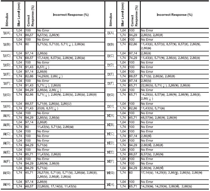
3. 17. The Character /ฑ/ (Tho Nangmontho)
Table 6 (a group of upper-left): The results suggest that every character tested for /ฑ/ was confused with the letter /ท/ (Tho Thahan). The optimal character for /ฑ/ belongs to those characters which have a loop with an exaggerated serrated line extending from the main body, such as the characters /ฑ(A)/ and /ฑ(C)/. Character /ฑ(G)/ has only a clear serrated line, yet it is still able to be perceived fairly well. On the other hand, the slight loop and unclear serrated line of character /ฑ(F)/ produce the highest percentage of errors - whereby it is mistaken as letter /ท/ (Tho Thahan). Likewise, the small loop part and eccentric diagonal line of the character /ฑ(B)/ confuse it with a wide variety of other letters.
The response percentages of the characters /ฑ/, /ท/, /น/, and /ม/
3. 18. The Character /ท/ (Tho Thahan)
Table 6 (a group of upper-right): The highest percentage of errors is ascribed to the thick-thin strokes in character /ท(E)/. The thick-thin strokes cause high amounts of confusion with the letter /ห/ (Ho Hip) (57.14% at blur level 1.04 mm and 77.14% at blur level 1.74 mm). The angle of the thin diagonal line and back stem converge in a way that creates a strong black spot resembling the second loop of letter /ห/. In addition, the same confused pair also happens with character /ท(A)/. The findings suggest that the best characters for /ท/ are the characters /ท(D)/, /ท(B)/, and /ท(G)/. Designing a minimal first loop may prevent confusion with other letters, particularly the letter /ฑ/.
3. 19. The Character /น/ (No Nu)
Table 6 (a group of lower-left): Almost all of the characters at blur level 1.04 mm still result in the correct responses, especially in the instance of characters /น(A)/ and /น(D)/ which had no errors. This finding confirms that the greater second loop can provide preferable legibility. Using a smaller, diminutive second loop can cause numerous errors such as seen for the characters /น(C)/ and /น(H)/ (i.e. /น(C)/ confused as letter /ผ/ (Pho Phung); /น(H)/ confused as letter /แ/ (Sara Ae)). Despite having a large loop, the thick-thin stroked character /น(E)/ is still confused with letter /บ/ (Bo Baimai) more than 30% of the time (at the blur level 1.74 mm) due to its thin lines.
3. 20. The Character /ม/ (Mo Ma)
Table 6 (a group of lower-right): Similar to the desirable findings of character /น/ (No Nu), almost all of the characters at the blur level 1.04 mm resulted in correct responses. Character /ม(B)/ shows the highest rate of correct responses, with only a few incorrect responses as the letter /น/ (No Nu). Therefore, it can be determined that having a larger second loop may enhance optimal legibility. The loops in character /ม(E)/ are both large, and it received slightly lower percentages of incorrect responses since it was perceived as letter /ฆ/ (Kho Rakhang) once subjected to the first blur level. It is thought that this might relate to the larger first loop. Character /ม(F)/ has a curved line instead of an oblique line, and obtained many incorrect responses. It was for confused as the letters /ย/ (Yo Yak) and /บ/ (Bo Baimai). The high contrast typeface of character /ม(G)/ had no errors at blur level 1.04 mm, but at blur level 1.74 mm the character was perceived as letter /น/ (No Nu) (22.86%).
3. 21. The Character /บ/ (Bo Baimai)
Table 7 (a group of upper-left): The highest amount of correct responses were given for the characters /บ(D)/ and /บ(F)/. Although perceived as letter / ู / (Sara Uu), it may simply be due to the similar proportion between letterforms /บ/ and / ู / (Sara Uu). The characters /บ(C)/ and /บ(H)/ had an error concerning letter /ย/ (Yo Yak) and others. It is difficult to ascribe a cause for this issue. There are many confused pairs with the character /บ/, such as letters /น/ (No Nu), /ม/ (Moma), /พ/ (Pho Phan), /ข/ (Kho Khai), and /ช/ (Cho Chang) - but only a slight amount for each.
The response percentages of the characters /บ/, /ย/, /ผ/, and /ฬ/
3. 22. The Character /ย/ (Yo Tak)
Table 7 (a group of upper-right): With there is no error, the character /ย(D)/ is the optimal letterform that relates to its distinguished serrated line and lower-curved line. If compare the results of the characters /ย(D)/ and /ย(A)/, character /ย(A)/ has a tendency to error as letter /บ/ (Bo Baimai) that might indicate a lower-horizontal line for character /ย/ may be most suitable. The unacceptable serrated line of the characters /ย(F)/, /ย(G)/, and /ย(B)/ may be a significant cause to confused as letter /บ/ (Bo Baimai) and /ข/ (Kho Khai).
3. 23. The Character /ผ/ (Pho Phung)
Table 7 (a group of lower-left): The results from the characters /ผ(H)/ and /ผ(G)/ reveal the importance of a serrated line for character /ผ/. Their minor serrated lines caused confusion with other characters, especially the letters /ย/ (Yo Yak) and /บ/ (Bo Baimai). The character /ผ(C)/ had no errors. The distinctiveness of /ผ(C)/ is due the presence of its front curved line, enhancing legibility. Although the characters /ผ(A)/ and /ผ(D)/ have no errors at blur level 1.04 mm, the findings reveal confusion with the letters /ม/ (Mo Ma) and /น/ (No Nu). This might be influenced by the lower-heavy angles of both characters. Character /ผ(F)/ uses a vertical line instead of a serrated line, and shows the same percentage of correct responses as the characters /ผ(A)/ and /ผ(D)/, but its letterform is still confused with the letters /พ/ (Pho Phan) and /ย/ (Yo Yak).
3. 24. The Character /ฬ/ (Lo Chula)
Table 7 (a group of lowe-right): The characters /ฬ(A)/ and /ฬ(H)/ have a coiled tail part within the frame of the characters (in the same horizontal level with their first loop) that disrupts identification of the letter /ฬ/, causing confusion with the letters /พ/ (Pho Phan), /ห/ (Ho Hip), and others. The narrow character width of /ฬ(G)/, with its large coil over the top, make it appear similar to letters that have an upper line (roof) i.e. the letters /ฉ/ (Cho Ching) and /ธ/ (Tho Thong). The proper characteristics for character /ฬ/ is found in the characters /ฬ(B)/ and /ฬ(F)/ which have slightly coiled tails over their main bodies. Both characters /ฬ(B)/ and /ฬ(F)/ could be perceived as letter /ฟ/ (Fo Fan) if their coiled tail part is not emphasized. Ultimately, both /ฬ(B)/ and /ฬ(F)/ are the letterforms that can best accommodate space for upper vowels (such as / ิ / (Sara I), / ี / (Sara Ii), / ึ / (Sara Ue), and / ื / (Sara Uee)) and other characters that are used on top of the consonants.
3. 25. The Character / ไ / (Sara Ai Maimalai)
Table 8 (a group of upper-left): When the character / ไ / is without a serrated line, such as in / ไ(G)/, it is confused with the letters / ใ / (Sara Ai Maimuan), / โ / (Sara O) and others more than 50% of the time. Even character / ไ(H)/, having greater counter space, was confused as the letters / ใ / (Sara Ai Maimuan) and / โ / (Sara O) just as much as character / ไ(G)/. The results for character / ไ(F)/ suggest that a longer diagonal tail over the apex of the stem might improve legibility when compared with character / ไ(B)/, which has a tail terminal equal with its apex.
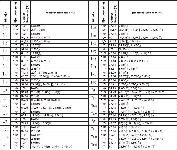
The response percentages of the characters /ไ/, /โ/, /แ/, and / ี /
3. 26. The Character / โ / (Sara O)
Table 8 (a group of upper-right): Most of the characters were confused with the letters / ใ / (Sara Ai Maimuan) and / ไ / (Sara Ai Maimalai). The character / โ / with a tail terminal that goes farther out from the vertical line of its loop, e.g. the characters / โ(E)/, / โ(F)/, and / โ(H)/, assist to identify the letter / โ /. Other characters that have a terminal equal with the vertical axis line of the loops are difficult to identify.
3. 27. The Character /แ/ (Sara Ae)
Table 8 (a group of lower-left): Characters /แ(F)/ and /แ(G)/ had the highest percentage of correct responses. With only one error each, it is interesting to note that they were confused as different pairs (i.e. letter /น/ (No Nu) belongs /แ(F)/ - letter /ผ/ (Pho Phung) belongs /แ(G)/). These errors can be explained. Character /แ(F)/ has large loops (particularly, its right loop) that make it appear similar to the second loop of letter /น/ (No Nu). Character /แ(G)/ has thin semi-circle loops which fade under blurred conditions, creating confusion with letter /ผ/ (Pho Phung). Likewise, the thin loops of character /แ(C)/ are positioned below its two stems resulting in the character being mistaken for letter /ผ/ (Pho Phung). The distance between the two stems is a key factor concerning visibility, as character /แ(H)/ has unacceptable space between the two, resulting in 40% incorrect responses.
3. 28. The Character / ี / (Sara Ii)
Table 8 (a group of lower-right): All the characters could be perceived to the group of the small upper consonant (i.e. / ิ / (Sara I), / ึ / (Sara Ue), / ื / (Sara Uee), including / ็ /(Maitaikhu). The findings suggest that a diminutive vertical line, / ี (D)/, could not guarantee preferable legibility, more than half of incorrect response is letter / ิ / (Sara I). Although character / ี (C)/ had the fewest amount of incorrect responses due to its simplified form, it was still confused with the letters / ิ / (Sara I), and / ึ / (Sara Ue). In order to enhance legibility, the character’s vertical line must be increased.
3. 29. The Character / ึ / (Sara Ue)
Table 9 (a group of upper-left): The very small form of the character / ึ (E)/ produced a great deal of confusion, especially with letter / ิ / (Sara I). It seems the letterform of character / ึ (D)/ may be the most appropriate form. The absence of an upper curved line as well as reforming the round loop into a vertical ellipse form might assist to improve both visibility and legibility.
The response percentages of the characters / ึ /, / ื /, /ๆ /, and /ฯ/
3. 30. The Character / ื / (Sara Uee)
Table 9 (a group of upper-right): The findings from / ื (C)/ and / ื (F)/ have confirmed the findings from character / ี (D)/ (See Table 8) suggesting that due to the two vertical lines upon the top of the main body, moving the first vertical line and placing it onto the back of the second line solitarily might assist to improve both visibility and legibility. Making this adjustment will create negative space between the body and the solitary line, clarifying this character’s unique aspects.
3. 31. The Character /ๆ / (Maiyamok)
Table 9 (a group of lower-left): A high percentage of correct responses for /ๆ(B)/ and /ๆ(E)/ suggest that some aspects shared between the two provide satisfactory legibility, e.g. a massive loop part, somewhat positive serrated line, and a curved line of a terminal. It has a clear serrated line and a curved line. These aspects prevent confusion with the letter /า/ (Sara AA) and other letters, especially better than other characters which have no curved line at their terminal. Examples of undesirable characters include /ๆ(G)/ which presented the highest percentage of incorrect responses. Due to its poor serrated line and a straightened terminal, confusion occurs with the letters / ไ / (Sara Ai Maimalai) and / ใ / (Sara Ai Maimuan). Similarly, the character /ๆ(H)/ has an unacceptable serrated line causing confusion with the letters / ไ / (Sara Ai Maimalai), /า/ (Sara AA), and / ใ / (Sara Ai Maimuan). To improve character /ๆ /, it is important to reduce its first loop and enhance its serrated line.
3. 32. The Character /ฯ/ (Paiyannoi)
Table 9 (a group of lower-right): The character /ฯ(B)/ has a proper character width and a visible upturned curved line, making its form quite advantageous over the other characters in the group. The forms of the characters /ฯ(F)/ and /ฯ(H)/ have a high frequency of confusion as the letters /ข/ (Kho Khai), / ุ / (Sara U), and /ร/ (Ro Rua). However, there is suspicion as to which feature provides the optimal solution: a straight terminal or the presence of a curved line at the terminal. The character /ฯ(E)/ has a slashed line that makes it easy to confuse as letter /ๆ / (Maiyamok), particularly found for blur level 1.04 mm. This reveals that using an upturned curved line is better than a slashed line.
3. 33. The Character / ั / (Mai Han-akat)
Table 10 (left): The character / ั / consists of an upturned curved line and a wide character width. Characters / ั (A)/, / ั (B)/, and / ั (F)/ are satisfactory forms, as there were only a slight percentage of errors, in the same case as letter / ้ / (Mai Tho). The narrower character width of /ั (E)/ increased its confusion with the letter / ้ / (Mai Tho) resulting in many errors when setting at blur level 1.04 mm. Character / ั (H)/ uses a horizontal line instead of an upturned curved line, causing a reduced height for this character, confusing it as letter / ิ / (Sara I) and others.
The response percentages of the characters / ั / and / ้ /
3. 34. The Character / ้ / (Mai Tho)
Table 10 (right): This character is easily confused as the letter / ั / (Mai Han-akat), especially for characters / ้ (E)/, / ้ (F)/, and / ้ (G)/ which had many errors. It is possible that the letterform is represented by the character / ้ (C)/ which has different proportions compared to the other characters, as well as the idealistic proportions of letter / ั /. For improved legibility, we suggest reformation of its slightly curved line (which connects between the loop down to the curved line below) to straighten and be made vertical. This design approach supports visibility as well.
From this finding, we found the simulated conditions revealed advantage and disadvantage of some key feature on visibility that led to legibility problems. Figure 2, the two graphs show the comparison of only the highest and lowest correct response selected from the thirty-four character sets, blur level 1.74 mm, the green characters are the highest of correct responses, the pink characters are the lowest of correct responses.

The comparison of only the highest and lowest correct response selected from the thirty-four character sets, blur level 1.74 mm
4. Conclusion
According to the assumptions we have noted (Punsongserm et al., 2017), the approach to the development of the glyph of Thai typeface with high legibility and visibility should involve the two key principles of ‘EMPHASIS’ and ‘REDUCTION’. In other words, emphasizing the unique characteristics which distinguish one character from another is the first consideration to be made in regards to achieving clarity and increasing legibility. Applying minimal reduction to certain aspects of the characteristics may be necessary as an additional measure of managing satisfactory visibility.
Figure 3 illustrates the idealistic key features or the approaches that may support improving Thai legibility. We have designed these characters for further study. From data analysis, the results suggest the various feature that necessary for thirty-four characters, selected characters. For example, clearness of a serrated line (/ฅ/, /ต/, /ย/, and /ผ/), jutting of loop with serrated line and diagonal tail (/ฃ/, /ซ/, /ช/, /ฑ/, /ส/, and /ฮ/), presence of more aperture and more counter as well as the proper of character width, using an upper line straight or curved for some characters, and so on. In order to create differentiation for isolated characters, we believe that all key features will enhance legibility and visibility.

The idealistic key features for improving Thai legibility
The idealistic key features may be provided to 5 features that should be considered to develop Thai universal design (UD) Typeface consist of; 1) type anatomy (e.g. clearness of a serrated line and jutting of a part of the loops /size of a loop); 2) character width (e.g. narrow or wide); 3) character shape (e.g. rectangular or circular); 4) stroke shapes-straight or curved (e.g. upper line, lower line, and front line) and; 5) terminal aspect (i.e. straight or sagged).
Consideration of proper character width along with a counter space is more important for improved visibility and enhanced legibility. Furthermore, jutting of a loop with a serrated line (i.e. /ฃ/, /ซ/, and /ฑ/) assures legibility over a shrunk loop (with serrated line). Having a minimal loop will assist to support legibility among their confused letter pairs (i.e. /ข/, /ช/, and /ท/). In addition, a protruded the second loop emphasized over a first loop guarantees legibility better than a shrunken second loop (i.e. /น/, /ม/ as well as /ฬ/). A tail terminal which protrudes out of the side of the main body (or line of body frame) is a preferable feature for identifying a letter (e.g. /ช/, /ส/, /ศ/, /โ/, and so on). Moreover, when distinguishing between a sagged-upper line (roof line) and a horizontal-upper line, the horizontal-upper line shows more acceptable results than the sagged-upper line (i.e. /ธ/, /ฮ/, and /ส/). A curved-lower line should be applied to a character which has a narrow form (e.g. /ข/) while a straight-lower line should be applied to a character which has a wider form (e.g. /บ/). In consideration of the parts of upper vowels and tone marks, not only do the same features need to be reduced and enhanced, but they also must enlarge their size to be as large as possible. The upper vowel may affect the design of some consonants that have ascenders or upper tails (e.g. /ฟ/, /ป/, /ส/, and so on), and in relation to the ratio of font body area, this case should be studied further into the future.
We believe that the approaches that have been stated above may assist to resolve visibility and legibility problems appropriately. The principles ought to be applied to Thai typeface design aiming to achieve both high visibility and high legibility, so as to benefit people with poor vision, e.g. myopia and cataract, as well as to be used as a body text type, focused on the very smallest point size, particularly concerning the text printed on consumer packaging.
Notes
Copyright : This is an Open Access article distributed under the terms of the Creative Commons Attribution Non-Commercial License (http://creativecommons.org/licenses/by-nc/3.0/), which permits unrestricted educational and non-commercial use, provided the original work is properly cited.
References
- Arai, T., Nakano, Y., Yamamoto, R., Hayashi, K., Takata, H., Handa, A., & Inoue, S. (2011). Development of a "universal design" font with blur tolerance (2): A comparison of the legibility of Ming, Gothic, and "universal design" typefaces. Retrieved October 14, 2016, from http://hakuhododiversitydesign.com/hdd/wp-content/uploads/2013/12/font-D_e.pdf.
- Diller, A. (1996). Thai and Lao Writing (W. Bright, Ed.). In P. T. Daniels (Ed.), World's Writing Systems (pp. 457-466). New York: Oxford University Press.
- Haas, M. R. (1956). The Thai system of writing. Washington: American Council of Learned Societies.
- Hakamada, H., Ohya, M., Sakai, A., Sakurada, A., Tomomi, O., & Okajima, K. (2011). Approach to UD Font (Universal Design Font) Development. NEC Technical Journal, 6(2), 51-56.
- Nakano, Y., Yamamoto, R., Ari, T., Inoue, S., Hayashi, K., Takata, Y., & Handa, A. (2010). Development of a "universal design" font with blur tolerance (1): A comparison of the readability of Ming, Gothic, and "universal design" typefaces. Retrieved October 14, 2016, from http://hakuhododiversitydesign.com/hdd/wp-content/uploads/2013/12/font-C_e.pdf.
-
Punsongserm, R., Sunaga, S., & Ihara, H. (2017). Thai Typefaces (Part 1): Assumption on Visibility and Legibility Problems. Archives of Design Research, 30(1), 5-23.
[https://doi.org/10.15187/adr.2017.02.30.1.5]

- Thai. (2015). Retrieved October 10, 2016, from http://unicode.org/charts/PDF/U0E00.pdf.