Controversy Visualization: How Controversial Public Discourse in Wikipedia Articles Evolves over Time
Background The editorial history of Wikipedia articles, especially those on controversial topics, shows the evolution of the topic and cues on whether they were written impartially. This study suggested a compact information-rich visual representation for a better understanding of the complex public discourse in a more intuitive and effective way.
Methods We developed Flow Circle and demonstrated its effectiveness by using a case of “Gun Politics in the United States” from Wikipedia. We also conducted a user study to compare the usability between Flow Circle and History Flow.
Results The structure and function of Flow Circle are explained through History Flow, CircosView, and MDS plot. This system provides various interaction methods for users to explore details in multiple aspects and levels. According to the user study results, the participants preferred Flow Circle over History Flow in terms of system functionality and intuitiveness.
Conclusions In the current study, we developed Flow Circle and suggested its effectiveness in analyzing complex text-based public discourse. Unlike previous approaches, Flow Circle showed integrated multiple data representation in one consistent design, and the user study results also supported its strengths.
Keywords:
Wikipedia Revision History Visualization, Public Discourse Analysis, Flow Circle, Integrated Design1. Introduction
With the growing popularity of Internet usage, individuals obtain the ability to actively express their opinions as well as to broadly participate in public debates and conversations. Wikipedia [21], for example, is one of the sources where individuals can voluntarily and collaboratively contribute their thoughts and expertise on a variety of topics. It aims at serving as a free online encyclopedia that allows any individual to edit articles based on their knowledge. It currently, as of June 2017, contains more than 40 million articles while more than 5.4 million of them are written in English [21].
Studies on analyzing how a consensus of an online article or a public discussion is formed have been widely performed in the past [2,5,8,16,19,20,22]. It allows us to have a better understanding of the relationship between the opinions made regarding a specific topic and their corresponding authors. To reduce the complexity of analysis, the temporal component of the discussion is usually neglected and is set to a fixed time point. However, the formation of a Wikipedia article usually includes multiple rounds of modifications (at different points of time) before it reaches the final consensus among all authors. In some controversial topics, contents may even be created and then deleted back and forth by authors with diverging opinions. It then becomes a non-trivial task to make sense of the history and evolution of this type of topics in Wikipedia. The goal of this study is to present a visualization tool that leverages the advantages of multiple visualization techniques so as to support a more comprehensive analytics on the controversy of public discourse in Wikipedia articles.
We presented an interactive visualization system, called “Flow Circle” [11], designed to assist in understanding the dynamics of controversial Wikipedia articles. For each article, we utilized the revision history data provided by Wikipedia and visualized the textual engagements of its authors and the editorial relationships between those authors. For example, we found that some authors might have been positive to certain topics, while some others are fairly negative. They might have addressed certain issues in a different perspective or even changed or deleted each others’ comments about an article. To support such analysis, Flow Circle incorporated three main visual components: 1) a History Flow [19], 2) a Circos visualization [10], and 3) a Multidimensional Scaling (MDS) view. These three components were integrated into one unified circular representation, and interactions linking each of the three views were implemented to allow detailed exploration of the relationships between different aspects of the data. A more detailed system demonstration video and downloadable software for both Mac OS and Windows can be found at https://goo.gl/fNNNph.
To evaluate the effectiveness of our design, we chose the article “Gun Politics” and visualized with Flow Circle to discern the historical evolution of the controversy occurred in the article’s revision history on Wikipedia, in which several authors with opposing opinions edited the article in ways to defend their own thoughts about gun safety and argued against each other. We also demonstrated how the MDS plot can facilitate in the process of comparing the relationship between authors and between keywords. Furthermore, we reported results of a user study, which measures 30 participants’ preference in Flow Circle and History Flow.
2. Wikipedia Revision HistoryExtraction and Visualization
We briefly introduced Wikipedia and described the data we extracted from its changelog [3]. Then, we discussed several previous proposed techniques for Wikipedia data visualization and their potential limitations.
2. 1. Wikipedia
Wikipedia was launched on January 15, 2001, as an experimental project related to an earlier encyclopedia site called Nupedia [13]. Nupedia took the conventional approach to encyclopedic writing: articles were written by an expert and approved only after a long review process, fact-checking, and editing. Instead, Wikipedia employed a freeform editing style. While Nupedia averaged in releasing only two new articles during the period of October 2001, to April 2003, Wikipedia successfully took over as its contents grew rapidly[21]. Since then, Wikipedia has gradually become a public platform, where individuals post information and express their opinions by creating, revising, and editing thousands of articles. Its success is often attributed to the individuals’ claimed ownership of entries [17], anticipated reciprocity [9], collective contribution [8], and individual empowerment [7].
Data generated in Wikipedia has been a popular source that researchers study on different aspects of the formation of public opinions, such as the edit war [7], nonlinear sequence of editing [15], and the process of information aggregation [22]. It is often identified as a public arena for information aggregation [22], coordination [19], collective intelligence [6], diversities [4], and conflict [1].
Wikipedia, like most other Wiki software, includes changelogs to keep tracking of the edits on its contents. This feature is vital for complying with the attribution requirements of some copyright licenses [3]. In our system, we first collected all changelogs recorded from a topic of interest as a HTML file. Then, we removed the HTML tags and extracted only the text parts from each log. From there, by comparing any two successive logs, we calculated the difference between them and stored the information about where the data and how much data has been added or removed. We also stored the information about the contributing author and the time of the modification.
2. 2. Visualizing Wikipedia Changelog with History Flow
History Flow [19] was proposed to help reveal complex records of contributions, conflicts, and collaborations occurred to a Wikipedia article.
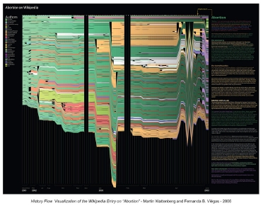
Figure 1 shows the revision history of the Wikipedia article on “Abortion” using History Flow [19]. While x-axis represents the time of revisions, the contribution made by an author over time is presented by a colored band that spans from left to right. The height of a band changes to reflect the total amounts of texts contributed by the author at the specific time point. As can be seen in Figure 1, the “Abortion” page on Wikipedia has been edited by more than ten authors and has experienced a complete deletion of contents for two times (the two black vertical gaps).
Although History Flow is effective in identifying the number of content changes over time, the editorial relationship between different authors and the sentiment of the contents are substantially neglected. In order to understand in what ways the general sentiment towards a topic has evolved and how authors have reflected the controversy with each other, a visualization system that incorporates more such information with a compact design and intuitive interaction methods is needed.
2. 3. Visualizing Author Relationships Using Graph-Based Visualization
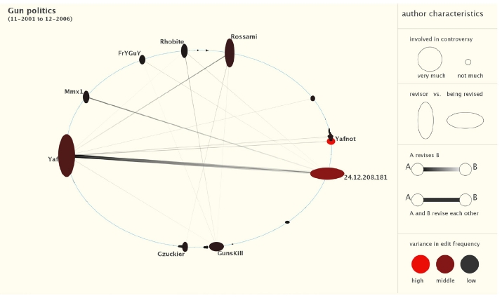
Graph visualization (Node-Link diagrams) has been known as an effective tool for the understanding relationship between multiple entities. In [2] and [16], graphs are used to depict the editorial relationship between authors of the same Wikipedia article. Authors and keywords are usually represented by nodes, while an edge between two nodes means that the two authors have conflicting opinions in the article and have reverted each others’ edits. Authors who have a similar opinion or write similar contents are placed close to each other so that the overall conflict patterns between groups of users can be easily observed. In [2], the node size and shape are used to indicate the revising behavior of the corresponding author.
Figure 2 is a screenshot exerted from [2] where it shows the intense editorial relationship between “Yaf” and “24.12.208.181”.
As these graph-based approaches effectively convey relationship among authors, presenting the temporal information in contrast is not as intuitive. In addition, the keywords and the relationship between keywords associated with each individual authors are not included in their analysis.
3. Visual Design of Flow Circle
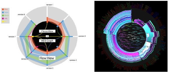
Flow Circle consists of three views: a Flow View, a Circos View, and a MDS view. Each view presents the revision history data in a different perspective and is transformed to fit into an unified circular representation. The arrangement of the views is illustrated in Figure 3(a).
3. 1. Flow View
In the Flow View, a History Flow-like visualization is used and is folded to form a circular shape, where the time proceeds clockwise instead of horizontally as in History Flow. This arrangement not only keeps the context of what has been changed over time, but also allows us to integrate with the Circos View. One thing worth noting is that in our Flow View, we mapped the color of the band to the sentiment of the contents, instead of merely differentiating authors, as used in History Flow. Texts with a more negative sentiment are drawn with a color that is closer to red, while positive sentiment are drawn in blue. If the contents are deemed as more neutral, the band will be drawn in white. This color coding is consistently used throughout the three views so that users are able to keep the context in track while viewing any of the views individually. As the example shown in Figure 3(b), the sentiment evolution of the article can be easily discerned.
3. 2. Circos View
In the Circos View, each node on the Circos represents the corresponding author who edited the article at the specific time point. An edge between any two nodes means that an author has edited (make changes, delete, or add new things) the content that was written by the other authors. With the Circos View, we can easily reveal typical editorial patterns, such as the so-called edit wars. For example, as seen in Figure 3(b), two groups of authors with diverging opinions frequently change the texts written by the opposing group of authors.
3. 3. MDS View
The MDS plot placed in the middle is meant to present the keywords that the authors of the article tend to use more frequently and to provide users with the sense of how the sentiment of these keywords are distributed. MDS [18] is a popular method to project the similarities or dissimilarities among objects from a high dimensional space onto a low dimensional space (usually 2D). In our system, we extracted frequently used keywords from the article and treated each of them as a node in the MDS plot. After applying MDS calculation, the geometric distance between any two nodes in the plot represents the similarity of the two keywords’ sentiment. That is, if two nodes are placed right next to each other, the two corresponding keywords have very similar sentiment in the context.
We further color-coded the node to verify the MDS result, i.e., bluer color refers to a more positive sentiment while redder color means a more negative sentiment. The MDS result in Figure 3(b) places most of the positive keywords on the right half of the circle and most of the negative keywords on the left half of the circle. It allows us to show the transition of an author’s opinion on the topic through further interaction and it will be discussed in more detail in later sections.
3. 4. Interaction
Flow Circle supports various interaction methods to let users highlight and view a certain part of the data in more detail.
- - Timeline slider
- We provided two slide-bars so that the user can control the start time and end time of the data that he/she wishes to visualize.
- - View size slider
- We provided a slide-bar to control the size of the visualization.
- - Author highlighting
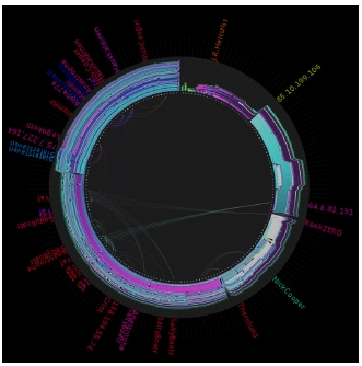
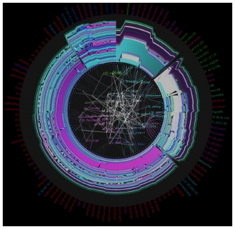
- The user can highlight or filter to see only the information related to a specific author by clicking on the corresponding colored band in the Flow view, clicking on the corresponding node in the Circos view, or selecting from an authors list sorted by the number of revisions made. In Figure 4, the visualization displays the detailed revision relationship between the author "Yaf" and the other relevant authors in the "Gun Politics" article.
- - Keywords highlighting
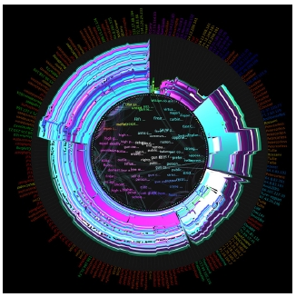
- The user can also click on a set of keywords from the MDS view to highlight the revisions and authors that are relevant to those selected keywords. For example, in Figure 5, if we select a set of keywords with negative sentiment, and it appears that negative contents were mostly added to or edited in the “Gun Politics” article near the beginning and the end of the revision history.
- - Highlighting author’s keyword transition
- We also allowed the user to view the sentiment transition of keywords that were written by a specific author. Figure 6 demonstrates the keyword transition of the author “Yaf”. We can see that Yaf’s revisions are mostly positive or neutral, while occasionally being somewhat negative.
4. Understanding the Controversy of “Gun Politicsin the United States” Using Flow Circle
4. 1. Data
The Wikipedia page of “Gun Politics in the United States” was edited by 18 authors in total. We extracted the following information: author names, dates and times of edits, revision contents, and keywords. There were 661 unrevised phrases extracted from the original transcript, and through the process of elimination, about 552 total keywords were selected. Keywords were chosen based on the frequency of occurrence to select important keywords to be used in the study. Through this process, 150 keywords with high frequency were selected from 552 keywords.
4. 2. Macro-Level Public Discourse Analysis Using Flow Circle
The controversy and the process of becoming mature of an article in Wikipedia have been a major research interest. Currie suggests that a high number of edits is a possible sign for controversy [5]. Rogers points out more specifically that controversy brings changes in the amount of content and the number of titles and headings [14]. Viégas et al. argues that the “zigzag” visualization reflects the edit war between authors, where competing authors revert contents back and forth [19]. Based on his study on “Featured Articles” chosen in Wikipedia, Myers also suggests that articles tend to be get “longer, better, more balanced” as they undergo more editing and controversy [12]. Within various criteria that define a quality article, the generally shared assumption is that the articles that endure the test of time may indicate quality, as the Wikipedia’s tenet also announces that “mature articles achieve greater neutral point of view (NPOV) precisely because they have more editors and hence more points of view” [5].
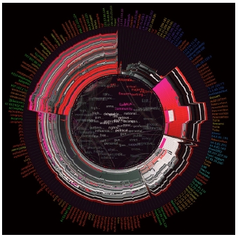
We visualized the Wikipedia page of “Gun Politics in the United States” using Flow Circle, as shown in Figure 7. One can quickly see that this topic was controversial with several indications: 1) the fast-growing number of edits, 2) the diversity and number of authors making the edits, and most importantly, 3) emergence of increasing, changing, and diversifying keywords and discussion points.
One particular pattern that can be seen in Figure 7 is the change of sentiment of the contents in this article. It started with mostly negative comments, but then experienced a bulk of abrupt revisions that made the sentiment to be mostly positive. Next, some authors decided to edit their contents into a more neutral form. After that, another bulk revision has been made to direct the article towards a negative sentiment. Finally, a more balanced sentiment of arguments within the topic was reached. This confirms our expectation that through the constant discussion of a controversy, the article matures and becomes more objective in the sense that it reflects the totality of the opinions, including various supporting and opposing views and, if mechanically, the movement towards “second-degree objectivity” [20].
Note, however, that whereas the article as a whole tends to grow in size and maturity, partial disruption may take place on and off, when a major revision is done by a particular author with a particular viewpoint. For example, in the “Gun Politics” article, there were two major revisions that took place on October 2006, and on February 2007, signifying that the changed portion strongly represented a one-sided point of view with the major keywords being close to one another in perspective, whether it be negative, positive, or neutral (which can be clearly observed in Figure 7).
5. Detail Comparison Between Keywords and Authors
To conduct a more thorough analysis on the relationship between keywords and relationship between authors, we performed a more detailed investigation to the MDS result.
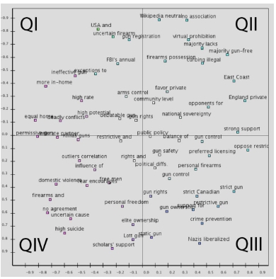
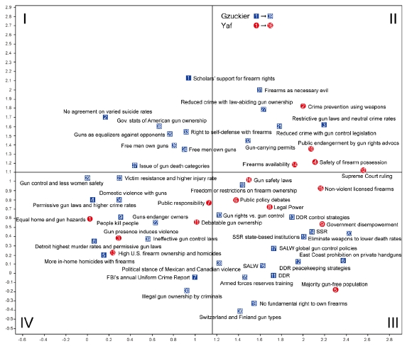
From the MDS result, shown in Figure 8, we discovered that Quadrant I and Quadrant IV consisted more negative connotation terms, while Quadrant II and Quadrant III consisted mostly positive terms, such as gun safety issues. The keywords that were placed close to the Y-axis were mostly neutral.
We compared activities from two authors, Gzuckier and Yaf, who contributed to most of the contents to the Wikipedia page, using the MDS result. To select the representative keywords, keywords of two authors were analyzed by cluster analysis. As a result, we selected keywords that generated significant clusters, excluding outliers that could not be clustered. The most edits were made by the author Gzuckier, with 39 total representative keywords chosen from his original set of 153 keywords. The second most edits were made by the author Yaf, with 16 total representative keywords chosen from the original set of 66 keywords. The keyword transition maps of Gzuckier and Yaf can be seen in Figure 9, where keywords associated with Gzuckierwere highlighted in blue, while keywords associated with Yafwere highlighted in red.
One similarity between the two authors is that Quadrant III consists most of the keywords from each author. By taking into account that Quadrant III falls in the positive side of the X-axis, it is thus expected that most of the contributions made by Yaf and Gzuckier are more approving of gun politics. When referring to the revision data, we find that the terms used by both authors are primarily positive or neutral.
6. User Study
History Flow [19] is one of the renowned Wikipedia visualizations. To compare the advantages and disadvantages of Flow Circle against History Flow, we conducted a questionnaire-based user study and evaluated the usefulness of Flow Circle. We recruited 30 participants from university, graduate school, and IT companies, all of which have some experience in visualization. In each session, we first explained the basic concepts of the two visualizations and then provided a demonstration of system functionalities. After that, each participant was asked to fill out a 13-item questionnaire. The questions, listed in Table 1, were given to participants to assess five different aspects of the visualizations: view, comparison, filtering, color, and system. The answers were provided based on a five-point Likert Scale, where 1 means “Strongly Disagree”, 2 means “Disagree”, 3 means “Normal”, 4 means “Agree”, and 5 means “Strongly Agree”.
Paired t-test was conducted to compare the usefulness of Flow Circle and History Flow. As the t-test results, shown in Table 2, it was found that the preference between Flow Circle and History Flow was significantly different in question 4, 5, 6, 7, 9, 10, and 12. Participants generally preferred Flow Circle more than History Flow except for the question 12. We assume that Flow Circle provides various aspects of information simultaneously so that it makes the changing pattern of an article not as straightforward. That is why Flow Circle had lower scores than History Flow in question 12. However, Flow Circle outperformed History Flow overall, suggesting that Flow Circle is better at providing intuitive and interactive functions that allows the users to compare differences to view detailed and important information.
7. Conclusion
Analyzing the evolution of controversy in public discourse, such as the edit war in a Wikipedia article, requires information from multiple aspects. By combining and integrating multiple visualizations that represent different perspectives of the data, we have shown that Flow Circlefurther extends the analytical capability from previously proposed tools. Flow Circle not only displays content change over time, but also presents the relationship of information among authors and keywords. Flow Circle enables its users to quickly discern the process of the formation of a controversial topic, i.e. from receiving fierce discussion among authors to gradually becoming mature. In addition, Flow Circle helps users compare the relationship among specific authors and their written keywords through flexible and intuitive interaction and filtering methods.
Notes
References
-
Arazy, O., Nov, O., Patterson, R., & Yeo, L. (2011). Information quality in Wikipedia: The effects of group composition and task conflict. Journal of Management Information Systems, 27(4), 71-98.
[https://doi.org/10.2753/MIS0742-1222270403]

-
Brandes, U., & Lerner, J. (2008). Visual Analysis of Controversy in User-Generated Encyclopedias*. Information Visualization, 7(1), 34-48.
[https://doi.org/10.1057/palgrave.ivs.9500171]

- Changelog. (n.d.). In Wikipedia. Retrieved September 30, 2016, from http://en.wikipedia.org/wiki/Changelog.
- Chen, J., Ren, Y., & Riedl, J. (2010, April). The effects of diversity on group productivity and member withdrawal in online volunteer groups. In Proceedings of the SIGCHI Conference on Human Factors in Computing Systems (pp. 821-830). ACM.
-
Currie, M. (2012). The feminist critique: Mapping controversy in Wikipedia. In D. Berry (Ed.), Understanding Digital Humanities (pp. 224-248). London: Palgrave Macmillan.
[https://doi.org/10.1057/9780230371934_13]

-
Greenstein, S., & Zhu, F. (2012). Collective intelligence and neutral point of view: the case of Wikipedia (No. w18167). National Bureau of Economic Research.
[https://doi.org/10.3386/w18167]

- Hasan, H., & Pfaff, C. C. (2006, November). The Wiki: an environment to revolutionise employees' interaction with corporate knowledge. In Proceedings of the 18th Australia conference on Computer-Human Interaction: Design: Activities, Artefacts and Environments (pp. 377-380). ACM.
-
Kittur, A., Suh, B., Pendleton, B. A., & Chi, E. H. (2007, April). He says, she says: conflict and coordination in Wikipedia. In Proceedings of the SIGCHI conference on Human factors in computing systems (pp. 453-462). ACM.
[https://doi.org/10.1145/1240624.1240698]

- Kollock, P. (2012). The economies of online cooperation: Gifts and public goods in cyberspace. In P. Kollock&M. Smith (Eds.), Communities in Cyberspace (pp. 219-240).London: Routledge.
-
Krzywinski, M., Schein, J., Birol, I., Connors, J., Gascoyne, R., Horsman, D., Jones, S. J. & Marra, M. A. (2009). Circos: an information aesthetic for comparative genomics. Genome Research, 19(9), 1639-1645.
[https://doi.org/10.1101/gr.092759.109]

- Lee, J., Kim, D., Park, J., & Lee, K. (2013, July). Flow circle: circular visualization of wiki revision history. In ACM SIGGRAPH 2013 Posters (p. 110). ACM.
- Myers, G. (2010). Collaboration: 'History' pages on Wikipedia. The discourse of blogs and wikis (pp. 129-144). A&C Black.
- Nupedia. (n.d.). In Wikipedia.Retrieved September 30, 2016, from https://en.wikipedia.org/wiki/Nupedia.
- Rogers, R. (2009). The end of the virtual: Digital methods (Vol. 339). Amsterdam University Press.
-
Sabel, M. (2007, October). Structuring wiki revision history. In Proceedings of the 2007 international symposium on Wikis (pp. 125-130). ACM.
[https://doi.org/10.1145/1296951.1296965]

- Suh, B., Chi, E. H., Pendleton, B. A., & Kittur, A. (2007, October). Us vs. them: Understanding social dynamics in Wikipedia with revert graph visualizations. In Visual Analytics Science and Technology, 2007. VAST 2007. IEEE Symposium on (pp. 163-170). IEEE.
-
Thom-Santelli, J., Cosley, D. R., & Gay, G. (2009, April). What's mine is mine: territoriality in collaborative authoring. In Proceedings of the SIGCHI Conference on Human Factors in Computing Systems (pp. 1481-1484). ACM.
[https://doi.org/10.1145/1518701.1518925]

-
Torgerson, W. S. (1952). Multidimensional scaling: I. Theory and method. Psychometrika, 17(4), 401-419.
[https://doi.org/10.1007/BF02288916]

-
Viégas, F. B., Wattenberg, M., & Dave, K. (2004, April). Studying cooperation and conflict between authors with history flow visualizations. In Proceedings of the SIGCHI conference on Human factors in computing systems (pp. 575-582). ACM.
[https://doi.org/10.1145/985692.985765]

-
Venturini, T. (2010). Diving in magma: How to explore controversies with actor-network theory. Public Understanding of Science, 19(3), 258-273.
[https://doi.org/10.1177/0963662509102694]

- Wikipedia. (n.d.). In Wikipedia.Retrieved July 20, 2017, from http://en.wikipedia.org/wiki/Wikipedia.
-
Xu, S. X., & Xiaoquan (Michael) Zhang. (2013). Impact of Wikipedia on Market Information Environment: Evidence on Management Disclosure and Investor Reaction. Mis Quarterly, 37(4), 1043-1068.
[https://doi.org/10.25300/MISQ/2013/37.4.03]

