Thai Typefaces (Part 1): Assumption on Visibility and Legibility Problems
Background Regarding the growing elderly population, which several countries are experiencing right now, various typeface designs have been developed to address the need for increased legibility and visibility. Certainly, common factors that affect the well-being of the elderly are related to visual acuity. The universal design fonts (UD fonts) developed in Japan are regarded as a role model for the development of highly legible and visible Thai typefaces. As Thailand’s society matures, the concern for creating a Thai UD font based on human-centered design is ideal for the purpose of supporting elderly people as well as people with amblyopia and low vision
Methods As the first step to developing a Thai UD font, as a preliminary study, we qualitatively tested the tolerance of Thai characters under blurred conditions. We used the fifty Thai conventional text fonts in the boundary of ‘The Table of Thai Character's Relationship’ in the same character heights as stimuli. The stimuli simulated the visual acuity of people with poor vision at different blur levels.
Results From the tests, we have established the expected Thai confused pairs, as the assumptions. We found the simulated condition revealed many problems with the visibility and the legibility matters of Thai Characters, as the assumptions; however, these findings led to ideas and possible solutions, which may provide assistance for the approach to designing the first Thai UD font.
Conclusions After the simulated blurring was administered to the Thai conventional text fonts, visibility problems gave rise to discovering legibility issues - and consequently - an escalation of confused pairs. Therefore, the approach to developing the glyph of Thai UD fonts should apply two principles, 'EMPHASIS' and 'REDUCTION' (and others), for overall improved visibility and legibility.
Keywords:
Thai Typeface, Isolated Letters, Visibility, Legibility, Letter Feature, Blurring Test1. Introduction
In Thailand, the percentage of the total population aged 60+ years was 10-19% in 2012, and by 2050, is expected to be 30% or more. (United Nations, 2012). Additionally, Prasartkul (2014) reported that Thailand had become an aging society as of 2005 when the birth rate in Thailand fell dramatically. Meanwhile, Thai people have been living longer than ever before. It is anticipated that within the next 10-20 years, Thailand will officially become a ‘completely Aged society’. Furthermore, it is estimated that by the year 2018, there will be more elderly citizens than children in the country of Thailand, with one in five of the total population being 60+ years or older.
In early psychological studies on legibility, visibility of typefaces, short-exposure and distance methods were the typical methods employed extensively for investigating letter identification and letter recognition, including: Banister (1927), Fisher et al. (1969), Bouma (1971), Townsend (1971), Geyer (1977), and van der Heijden et al. (1984), as the studies using the short-exposure method; Sanford (1888), Bouma (1971), Phillips et al. (1983), as the studies using the distance method. Other studies, like Brown (1963), Uttal (1969) and Loomis (1982) had examined legibility of letters under low-visibility conditions. However, each of these reports provided different results that may have been caused by using heterogeneous typefaces, i.e. difference in typeface classification according to Milloy (1978) have commented on the difference between the typefaces that Geyer (1977) and Bouma (1971) used in their study, as well as variance between the methods.
Even though quantitative research, as mentioned above, has provided reliable, perspicuous results the disadvantage of this focus may be an inability to conduct comparative tests using several fonts simultaneously. Thus, qualitative research may be a parallel method that reinforces plausibility on legibility study. In other words, qualitative research studies may be an effective way for preliminary surveying and establishing some hypotheses, leading to further research.
From the past to present, there has been a difference in the usage of terminology, i.e. legibility; visibility; and readability have been used as a synonym for each other. In this study, the terms are used specifically and refer to individual yet interdependent functions. ‘Legibility’ refers to how easily individual letters can be distinguished from one another. 'Legibility' is a concern with the form and essential characteristics of each letter (positive space). Meanwhile, 'Visibility' is determined by factors that either permit or hinder visibility entirely. Not only is visibility concerned with the negative space of a character (i.e. closed counter and opened counter), it also has implications for methods that simulate external factors involved in blocked visibility. Low pass filtering, reducing the contrast between print type and background, and so on, are examples of external factors that interfere with the visibility of a character. Inadequate 'Visibility' can cause erroneous interpretations of characters, which in turn affects matters related to legibility. The term 'Readability' (which was not used or involved in this study) refers to the ability for reading word-sentence-paragraph-text and running text correctly and accurately; also, 'Readability' is correlated to 'Visibility' due in part to interletter spacing and leading of letters, including negative space. These factors support speed of reading.
The studies on the legibility of letters and investigations of isolated letters have rarely been performed in Thailand. Moreover, the development of a typeface based on scientific method is not yet evident. Punsongserm (2015) reported that development has been predominantly focused on designing display fonts, especially the Roman-like Thai Fonts, which are also used superfluously as body text. In his research, Punsongserm found that overall, such Roman-like fonts were inefficient and insufficient compared to the Thai conventional text fonts - both in the accuracy and speed of reading. Additionally, his observers found the Roman-like Thai Fonts as a body text type unacceptable.
The aim of this study, as qualitative research, is to examine underlying stages in legibility and visibility matters of Thai typefaces in order to identify the problems and shortcomings under simulated conditions of low visual acuity, with blurred characters. This research will be preliminary surveying for further study concerning quantitative research.
Thai characters consist of eighty-seven characters: forty-six consonants, eighteen vowels, four tone marks, ten digits, seven signs, one repetition mark, and one currency symbol for the Unicode Standard (Thai, 2015). However, for a better understanding of details regarding the Thai writing system, literature such as 'The Thai System of Writing' (Hass, 1956) and 'Thai and Lao Writing' (Diller in Daniels & Bright, 1996) are recommended resources. In order to comprehend more about the legibility of the Thai letter, knowledge of the eight characteristics of the type anatomy for each Thai letter is required, including a line, a first loop, a tail, a second loop, a foot, a beak, a limb, and a core. Figure 1 shows the eight characteristics which are varied to infinitely aspects.

Characteristics of Thai type anatomy
2. Methods
In order to simulate the conditions of low visual acuity, various methods have been applied. Among the common methods included a blur simulation by computer software (Yamamoto & Yamamoto, 2000), a wide view ground glass filter (Nakano et al., 2010; Arai et al., 2011), and pseudo-cataract experience goggles (Hakamada et al., 2011). All of the researchers conducted the comparative test between their universal design font and the various conventional text fonts.
Since the Thai conventional text font has many characteristics, as the preliminary study, we studied the Thai fonts as much as possible. Finally, we chose to use the computer software for simulation of blurred vision. This method made the process of predicting legibility for the low visual acuity easiest.
2. 1. Materials
In our blur test, we classified fifty Thai conventional fonts into ten categories based on the loop characteristics and the stroke characteristics. The loop characteristics are classified based on whether a rounded loop, an oval loop, a semi-circle loop, a solid loop, an open loop, or other types of loops are included or not. Strokes are characterized by properties such as an even weighted stroke with a base serif, an even weighted stroke without a base serif, thick and thin strokes with a base serif, or thick and thin strokes without a base serif. Table 1 shows a sample of the Thai typefaces for blurring tests.

Ten sample typefaces selected for testing
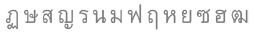
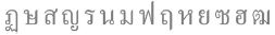
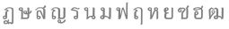
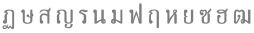
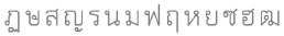
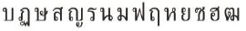
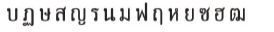
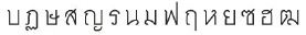
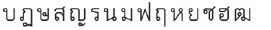
The fifty Thai conventional text fonts were tested in the form of ‘The Table of Thai Character's Relationship'. This table was developed by Rojarayanont (Rojarayanont, 2001) to assist in the comparison of legibility of letters. We reproduced images of the table with different levels of blurring applied. Figure 2 shows an example of the Thai characters in ‘The Table of Thai Character's Relationship’ that illustrate a comparison of being similar to or the same as the characters’ group.

Table of Thai Character's Relationship (Adapted from Rojarayanont, 2001)
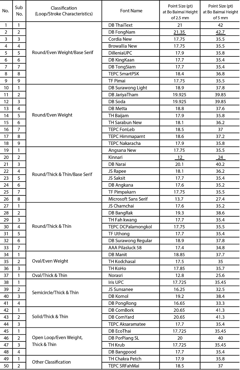
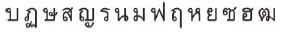
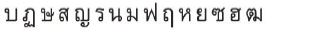
Legge & Bigelow (2011) state that “The common typographic measure is the ‘point’, which has had different definition over the centuries in different countries” they find that “Measures of x-height provide a convenient metric, being familiar to typographers and vision researchers. Easy transformations exist for conversion of x-height between physical size and visual angle.”. Likewise, despite being set at the same point size, the heights of conventional Thai fonts vary. Accordingly, we selected two levels for the height of character /บ/ (Bo Baimai) in order to equalize the heights of all other characters within a given font. The Bo Baimai heights selected are 2.5 mm (7.087 pixels) and 5 mm (14.173 pixels), which represent an average small font size and large font size. The conversion to a visual angle (VA) in degrees from physical print size are VA = 0.3575 of 2.5 mm, VA = 0.715 of 5 mm, for a viewing distance of 400mm. The Bo Baimai height of 2.5 mm was correlated as representative of a small point size for conventional Thai fonts, which range between 12 to 21.35 points (when set at the same font size). The Bo Baimai height 5 mm was correlated as representative of a quite large point size for conventional Thai fonts, with heights ranging from 24 to 42.7 points (when set at the same font size). (See also Appendix: A comparison with Point Sizes of The Thai Fonts in the Same Bo Baimai Height).
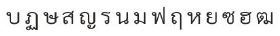
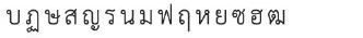
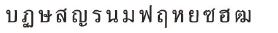
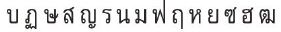
However, Bo Baimai height 2.5 mm is somewhat larger than common sizes used in everyday Thai books and Thai newspapers. Usually, the most common font sizes for text in Thai books and newspapers are between 12-16 points, yet no less than 7 points for text in Thai packaging. Figure 3 illustrates the types set at the Bo Baimai height of 2.5 mm and the Bo Baimai height of 5 mm.

Thai type set at Bo Baimai height 2.5 mm (Upper), and 5 mm (Lower)
Figure 4 shows the lines and areas of Thai font, including phases of the Bo Baimai height within the consonant and vowel areas respectively. The lines consist of the top line, the top line of an upper vowel, the top line of a consonant, the baseline of a consonant, and the bottom line. The areas consist of the upper tone mark area, the upper vowel with tone mark area, the consonant area, and the lower vowel area. Most fonts may be specified by the boundary of the character height (fraction) as follows: upper tone mark = 0.15, upper vowel and tone mark = 0.2, consonant = 0.4, and lower vowel = 0.25.

Lines and Areas of Thai Font (Adapted from Rojarayanont, 2001)
The height of Thai font set at the same point size depends on the font typeface as well as characters. Table 2 shows the comparison between typefaces set at the same Bo Baimai height and typefaces set at the same point size. Clearly, the heights of typefaces are not always consistent despite being set at the same point size, as shown in the right-hand column of this table. On the other hand, each font normalized by Bo Baimai height settings reveals a height comparison that is nearly equal or the same. Hence, normalization by the height of the character /บ/ (Bo Baimai) accurately regulates equalization of character heights within any given font.
A comparison between typefaces set at the same Bo Baimai height (Left) and those set at the same point size (Right)
Fisher et al (2005) have defined that "a 'Gaussian blur' or 'Gaussian smoothing' is an image processing operation aimed to attenuate image noise computed by convolution with a mask sampling a Gaussian distribution." And, "Low pass filters are a kind of smoothing or noise reduction filter.". Likewise, a 'Gaussian blur' in image processing is a low pass filter that is used to reduce image noise and reduce detail by various graphics software. This blurring technique provides a visual effect as a smooth blur resembling that of viewing the image through a translucent screen. Applying a Gaussian blur has the effect of reducing the image's high-frequency components, and is distinctly different from the 'bokeh effect' produced by an out-of-focus lens (Wikipedia, 2016; September 14). Therefore, it's possible that Gaussian Blur might be described as low-pass spatial frequency filterings like the ground-glass diffusers which were used in the study of Legge et al. (1985) and Nakano et al. (2010).
The fonts were blurred by Gaussian Blur Effect on Adobe Illustrator CC, Windows 7, in order to simulate low visual acuity conditions of Gaussian Blur Filter. The blur levels were set to 3, 5, and 7 pixels (i.e. the standard deviation: 1.04, 1.74, and 2.43 mm, respectively), and, 7, 9, and 11 pixels (i.e. standard deviation: 2.43, 3.13, and 3.82 mm, respectively) for the Bo Baimai heights of 2.5 mm (7.087 pixels) and 5 mm (14.173 pixels), respectively. The blur levels were approximately proportional to the Bo Baimai height.
In terms of visual acuity levels: Bo Baimai heights of 2.5 mm, we assumed the blur level of 3 pixels as parafoveal vision, and another as peripheral vision; Bo Baimai heights of 5 mm, the blur level of 7 pixels as parafoveal vision, and another as peripheral vision. Under the simulated visual acuity conditions, when the standard deviation of the Gaussian Blur Filter is 3 pixels and the viewing distance is assumed to be 400mm, the visual acuity is 0.07.
2. 2. Procedure
We printed the blurred Thai Character's Relationship Tables via a laser printer onto uncoated paper, using grayscale-resolution 300 dpi. We observed the legibility and visibility of the fonts by ourselves.
3. Results and Discussion
For an overview of our findings, the results indicate that most of the Thai typefaces at 2.5 mm of Bo Baimai height could endure level 1.04 mm blurring. Issues of clarity began at level 1.74 mm blur. At level 2.43 mm blur, most characters could not be identified, with the exception of some characters, such as /ว/, /ง/, /บ/, /ป/, /ก/ and so on, which possess a simple form. Most of the Thai typefaces at a 5 mm Bo Baimai height could endure level 2.43 mm blur but began to lose adequate clarity at levels 3.13 mm and 3.38 mm blur. Nevertheless, the test on Bo Baimai height 5 mm of all typefaces discovered less of an issue than the test on Bo Baimai height 2.5 mm. For this reason, we will mainly focus on and provide examples of the results from the test on Bo Baimai height 2.5.
3. 1. Remarks on the Visibility of Thai Typefaces
The degree of visibility consisted of five separate groups of consonants ranging on a scale from high-visibility to low-visibility. The consonant groups are differentiated based on letterform characteristics, which also involve open and closed counter aspects. The five groups are, ranging from high-visibility to low-visibility: simple form, narrow form, quite a complex form, complex form, and very complex form; as shown in Figure 5. The three complex form groups will require careful consideration in regards to visibility solutions, while the first two forms might not pose an issue.

The visibility degrees of Thai characters, consonants only, separated by counter aspects
The Character /ข/ (Kho Khai) / No.1 of Figure 6: In order to distinguish between the characters /ข/ and /บ/ (Bo Baimai), the character /ข/ must be designed with a character width narrower than the character /บ/. In the blurring views, No.1 of Figure 6, counter aspect is one of the causes of the visibility problems, leading to trouble for the character /ข/. In other words, it is difficult to tell the difference between the two characters because of the character /ข/ simply has a counter space less than the character /บ/. To address this issue, if possible, a v-shape may be applied for the character /ข/, which should assist to decrease this problem.

The visibility problems with the consonants, some assumptions
The Character /ช/ (Cho Chang) / No.2 of Figure 6: The character /ช/ is /ข/ with an added diagonal-right tail as the only difference from /ข/. The character /ช/ has the same, narrow width of character as /ข/. Most typefaces have a closed counter for the character /ช/ while only a few typefaces have an opened counter displaying slight aperture. In short, /ช/ has lower visibility than /ข/. This finding suggests that resolving to design the character /ช/ with an opened counter is probably the most appropriate approach.
In addition, designing a loop to squeeze space of the characters /ข/ and /ช/ created a visibility problem. Using a normal loop may improve visibility. Moreover, /ช/ and /ซ/ (So So) have the advantage of increasing in character width so that they appear wider than characters /ข/ and /ฃ/ (Kho Khuat), while still being able to distinguish themselves from the letters /บ/ (Bo Baimai) and /ป/ (Po Pla). This is because both /ช/ and /ซ/ have a diagonal-right tail, which maintains their unique legibility.
The Character /จ/ (Cho Chan) / No.3 of Figure 6: The Thai character /จ/ has narrow character width and also has somewhat negative space. Some typefaces consist of two vertical lines, whereas, other typefaces consist of two diagonal lines. Both aspects are the cause of visibility problems. For examples of preferable letterforms, the character /จ/ of the TEPC SmartPSK Font is quite acceptable (see the first letter of the second row); the DB Metta Font is desirable because the aperture is nice and wide (see the second letter of the second row); meanwhile, the TH Saraban New Font displayed more visibility within a counter than any other glyph (see the third letter of the second row). Examples of undesirable letterforms include /จ/ of the TEPC Himmaparnt Font which displays poor visibility due to its squeezed loop (see the first letter of the third row), and the TEPC DCPalamongkol Font has a character width that is much too wide (see the second letter of the third row), which can cause it to be confused with either the letter /ฉ/ (Cho Ching) or /อ/ (O Ang).
The Characters /ส/ (So Sua) and /ศ/ (So Sala) / No. 4 and 5 of Figure 6: In various Thai fonts, the tails of characters /ส/ and /ศ/ are observed in two different styles. The first style is that the tails are designed on the top line of the character (see the first row of No. 4 and 5). In the second style, the tails cross down through the top line and into the inside of the character (see the second row of No. 4 and 5). However, under blurred conditions, the second style - the one with the crossed tail - incurred opacity within those characters, obscuring the view. Interestingly, the cross tail was originally designed to assist with character legibility. Nevertheless, using the added tail and designing it with more length may be the best approach for improved visibility.
The Character /ฮ/ (Ho Nokhuk) / No.6 of Figure 6: The coiled tail of character /ฮ/ creates somewhat negative space within the character, and may also engender ambiguity alongside the character /ส/ (in the case of legibility). From this finding, designing the character /ฮ/with the approach of DB Metta Font may be an improved way to increase visibility (see the third letter) as well as having a longer tail.
The Character /ฬ/ (Lo Chula) / No.7 of Figure 6: The character /ฬ/ has always posed a problem whenever it encounters a vowel (vowels are positioned over the top of the letters, such as /ิ/, /ี/, /ื/, and so on). Therefore, most of the fonts for the character /ฬ/ were designed to have a low, extra-short coiled tail beside its apex for solving such a problem. Of course, this vowel-accommodating design negatively affects visibility. Similarly, the character /ห/ (Ho Hip) has trouble with legibility when coupled with a vowel (see No.7 of Figure 6, the second letter of the first row). A visibly ideal character design may involve the approaches of DB Surawong Font (see the fourth letter of the first row) and TH Baijam Font (see the third letter of the second row) for further development.
The Character /ธ/ (Tho Thong) / No.8 of Figure 6: In various Thai fonts, two counter characteristics have been discovered. One is a closed counter, and the other is an opened counter. The opened counter seems to provide greater visibility than the closed counter.
The Characters /ฎ/ (Do Chada) and /ฏ/ (To Patak) / No.9 of Figure 6: Visibility problems were found in most typefaces, which also contributed to an issue of legibility. No.9 of Figure 6 shows character visibility as a comparison between having a narrow aperture (the first pair of letters) and wide aperture (the second pair of letters). Basically, a wider aperture is necessary for the visibility of both characters.
The Characters /ถ/ (Tho Thung), /ก/ (Ko Kai,) and /ภ/ (Pho Samphao) / No.10 of Figure 6: Problems concerning visibility were not found for the characters /ก/ or /ภ/, whereas the character /ถ/ had an issue due to its loop placement within the counter space, inside the front vertical line. Therefore, as a suggestion, the character /ถ/ ought to have a wider character width than the other two characters, /ก/ and /ภ/.
The Characters / ไ / (Sara Ai Maimalai), / ใ / (Sara Ai Maimuan) and / โ / (Sara O) / No.1 of Figure 7: All characters resulted in an indistinguishable appearance (see the black spot on the upper portion of each of them) causing problems of legibility. To improve these letters, the detail of the spiral for character / ใ / should be reduced so that the appearance of the black spot disappears, the vertex (serrated line) of character / ไ / should be expanded to an angular degree, and the length of the tail of character / โ / should be enhanced.

The visibility problems with the vowels and the tone marks, some assumptions
The Characters /ิ/ (Sara I) /ี/ (Sara Ii) /ึ/ (Sara Ue) /ื/ (Sara Uee) / No.2 of Figure 7: All characters appear as black spots, resulting in inadequate legibility. It is possible that all vowels are made smaller than consonants. As a solution, an exempt horizontal line could be made for clearer visibility of these vowels.
The Characters /๊/ (Mai Tri) and /็/ (Maitaikhu) / No.3 of Figure 7: These characters appear as black spots and in most typefaces cannot be identified. The solution for this problem could be to make two sets of typefaces: one set made without a loop for use with smaller point sizes, and another set (with a loop) for use with larger point sizes.
Furthermore, in the case of loop characteristics, the rounded loops achieve more visibility than other loops. Rounded loops display negative space more clearly. Likewise, in the case of stroke characteristics, it seems even-weighted strokes achieve more visibility than thick & thin strokes, as they display a preferable level of consistency necessary for higher visibility.
3. 2. Remarks on the Legibility of Thai Typefaces
Most Thai typefaces could endure blurring at the degree of 1.04 mm (at 2.5 mm of Bo Baimai height), except for some letters such as /ฎ/ and /ฏ/, which were not easily distinguishable from each other due to the complexity of their tails. There are also some vowels that have a similar characteristic, such as /ึ/ and /ื/ , which could not be easily distinguished from each other, either.
With the pixel blur set to level 1.74 mm, legibility began to decline, revealing which characters were most vulnerable. Vulnerable characters included: / ไ - ใ - โ /, /ข - ฃ/, /ช - ซ/, /ด - ต - ค - ต/, /ย/, /ี- ื - ึ /, /ถ/, and /๋ - ๊ - ็ - ้ - ์ /, and so on. Figure 8 shows the confused pairs of such characters and other pairs.

The expected Thai confused pairs, as the assumptions
Figure 9 shows the characters in 'The Table of Thai Character's Relationship' as they appear when blurred. The blurred characters reveal that not only do confused pairs occur within the same characters’ vicinity (see the straight arrows), but they are also confused with various characters spread across the table (see the curved arrows). Pairs of characters which are confused with their neighboring character are called relatively confused pairs. The pairs of characters that are arbitrarily confused with one another (relative to the relationships organized in the table) are called non-relative confused pairs.

The confused pairs under blurred conditions in 'The Table of Thai Character's Relationship'
The findings suggest that legibility problems involve visibility problems, and may be related to some of the key characteristics of Thai glyphs - consisting of a first loop, a second loop, a serrated line, a tail, and a beak (Punsongserm, Sunaga & Ihara, 2015) (Figure 10). These characteristics can either be reduced or emphasized in order to improve legibility and visibility of characters.

The five key features
The following notes describe the legibility issues in regards to confused pairs, other character relationship dynamics, and suggestions for the design priorities of a UD Thai typeface.
Characters /ฉ/ (Cho Ching) and /อ/ (O Ang): Results indicate that the smaller second loop in character /ฉ/ tends to cause problems in legibility, and can be confused with character /อ/. Therefore, in terms of designing glyphs of such characters, the second loop in /ฉ/ must be enhanced and emphasized, whereas its first loop may be simplified or made smaller to increase legibility between characters.
Characters /ฃ/ (Kho Khuat) and /ฑ/ (Tho Nangmontho): These characters include the features of a first loop and serrated line. The serrated lines have been given the first priority, as they are the single difference between the characters /ฃ/ and /ข/ (Kho Khai), as well as characters /ฑ/ and /ท/ (Tho Thahan). Therefore, designing glyph of the characters /ฃ/ and /ฑ/ ought to decrease the significance of the first loop and increase clarity of the serrated line. It is also possible that abandoning the first loop will not incur any legibility problems in this particular pair of characters.
Characters /ฅ/ (Kho Khon) and /ต/ (To Tao): When both characters were viewed under blurred conditions, their first loops and serrated lines were very difficult to identify. In other words, the first loops of both characters were not distinct enough to differentiate between the characters /ฅ/ and /ต/. Likewise, their serrated lines were not obvious, making the characters /ฅ/ and /ต/ easily confused with the characters /ค/ and /ด/ (Do Dek) respectively. When the first loops and the serrated lines are not clearly emphasized, both /ฅ/ and /ต/ are nearly impossible to accurately interpret.
The serrated line of character /ย/ (Yo Yak) does not retain clarity under blurred conditions and could be mistaken as the character /บ/ (Bo Biamai). Additionally, the slight v-shape at the base of character /ผ/ (Pho Phung) is not clearly emphasized, and may be mistaken as either the characters /ม/ (Mo Ma) or /น/ (No Nu).
The diagonal tails of characters /ช/ (Cho Chang), /ศ/ (So Sala), and /ส/ (So Sua) should be clearly emphasized, for, under blurred conditions, they can be confused with characters /ข/ (Kho Khai), /ค/ (Kho Khwai), and /ล/ (Lo Ling) respectively. Therefore, designing glyph for the characters /ช/, /ศ/, and /ส/ must consider reducing the significance of their first loops.
The coiled tails of characters /ฮ/ (Ho Nokhuk) and /ส/ (So Sua) create the complexity of negative space within each character, of which these details are lost under blurred conditions. This problem seems to be influenced by the subtle feature of the coiled tail. Therefore, when designing legible glyph, coiled tails should be replaced by a diagonal line that connects at the corner of the top line. This may assist in forming a clearer space inside each character (counter) which is better for visibility purposes. However, it is important to consider emphasizing the length of the tail, for if too short, characters /ฮ/ and /ส/ may be confused with the character /อ/ (O Ang).
In characters /ถ/ (Tho Thung) and /ก/ (Ko Kai), the first loop is the only differentiating feature. In the case of any pair of characters with a first loop difference, the loops of such characters must be emphasized, as they may otherwise be confused with one another. While the loop must have priority over the beak as an emphasized characteristic, the beak must not be overlooked. The beak will need to be simple yet distinct, as a consequence for emphasizing the loop and over-simplifying the beak could potentially lead to mistaking /ถ/ with the character /ด/ (Do Dek).
Character /ซ/ (So So): First and foremost, the serrated line and the tail should be emphasized in order to achieve better legibility. Adjusting the first loop is not necessary. Under blurred conditions, lack of clarity in the serrated line causes confusion between /ซ/ and the character /ช/ (Cho Chang). Similarly, when the tail of /ซ/ lacks clarity, /ซ/ can be confused with the character /ฃ/ (Kho Khuat). Furthermore, when both the serrated line and the tail of /ซ/ lack clear definition, it is possible to confuse /ซ/ with the character /ข/ (Kho Khai).
Characters /ฎ/ (Do Chada) and /ฏ/ (To Patak): Typically, when used in small point sizes, these characters are already easily confused before any blurred conditions have been applied. Some typefaces have used varying lengths of tail for each in order to distinguish the two characters apart from one another. A shorter tail has been given to /ฎ/, which protrudes forward less than the longer tail given to /ฏ/. There are still complications for legibility, though. A design solution should prioritize emphasizing an obvious difference between the tails of both characters, maintaining reduced similarity as much as possible. We suggest the counter of the tail for character /ฎ/ be emphasized in order to display its specific tail feature. Meanwhile, the serrated line in the tail of character /ฏ/ should receive clear, distinct emphasis in order to stand out, as opposed to merely emphasizing the counter of its tail. In addition, it is also possible to reduce the importance of the first loop and the beak in each character.
Character /ฬ/ (Lo Chula): The subtle, coiled tail of character /ฬ/ poses a problem for legibility. When the coiled tail is at the same level with its first loop, /ฬ/ begins to be confused with the character /ห/ (Ho Hip), because its shortened, stubby coiled tail starts to look more like the second loop in the character /ห/. If the coiled tail of character /ฬ/ is too small and simplified in general, it can be easily confused with character /พ/ (Pho Phan). Accordingly, the coiled tail of character /ฬ/ ought to be emphasized as the top priority of glyph design for this character, followed by consideration of its v-shaped line within the counter space, and finally, it may assist to reduce and simplify its first loop.
To summarize the above notes on legibility findings, the approach to the development of the glyph of Thai UD fonts should involve the two key principles of ‘EMPHASIS’ and ‘REDUCTION’. In other words, emphasizing the unique characteristics which distinguish one character from another is the first consideration to be made in regards to achieving clarity and increasing legibility. Applying minimal reduction to certain aspects of the characteristics may be necessary as an additional measure of managing satisfactory visibility.
4. Conclusion
The article explains that when the Thai conventional text fonts were subjected to simulated blurring, both visibility and legibility problems were discovered as a result. In the case of visibility, problems occurred with several characters, especially, the groups of characters which have the complexity of letterform (i.e. the complex form group, and the very complex form group). Small-sized characters, such as the vowels and the tone marks also presented visibility concerns. Moreover, visibility issues have an overall effect on the legibility problem that was discovered in the escalation of confused pairs, both relatively confused pairs and non-relatively confused pairs.
In stroke-weight matters of each typeface, it does not seem to affect this study due to the characters being tested individually. However, if the characters are tested in the form of word-sentence-paragraph, a problem regarding legibility may perhaps be more evident. As this point relates to the readability matter, it is possible that the issue will be studied in the future.
According to the observations, we have noted, we conclude with some ideas and recommendations for future improvement of Thai characters (i.e. the principle: ‘EMPHASIS’ and ‘REDUCTION’, and others). We believe that the principles of ‘EMPHASIS’ and ‘REDUCTION’ may assist to resolve visibility and legibility problems appropriately. The principles ought to be applied to Thai typeface design aiming to achieve both high visibility and high legibility, so as to benefit people with poor vision, as well as to be used as a body text type, focused on the very smallest point size, particularly concerning the text printed on consumer packaging.
Notes
Copyright : This is an Open Access article distributed under the terms of the Creative Commons Attribution Non-Commercial License (http://creativecommons.org/licenses/by-nc/3.0/), which permits unrestricted educational and non-commercial use, provided the original work is properly cited.
References
- Arai, T., Nakano, Y., Yamamoto, R., Hayashi, K., Takata, H., Handa, A., & Inoue, S. (2011). Development of a "universal design" font with blur tolerance (2): A comparison of the legibility of Ming, Gothic, and "universal design" typefaces. Retrieved October 14, 2016, from http://hakuhodo-diversitydesign.com/hdd/wp-content/uploads/2013/12/font-D_e.pdf.
-
Banister, H. (1927). Block Capital Letters As Tests Of Visual Acuity. British Journal of Ophthalmology, 11 (2), 49-62.
[https://doi.org/10.1136/bjo.11.2.49]

-
Bouma, H. (1971). Visual recognition of isolated lower-case letters. Vision Research, 11 (5), 459-474.
[https://doi.org/10.1016/0042-6989(71)90087-3]
-
Brown, D. W. (1963). Recognition of typed letters in noise. Information and Control, 6 (3), 301-305.
[https://doi.org/10.1016/S0019-9958(63)90370-X]
- Diller, A. (1996). Thai and Lao Writing (W. Bright, Ed.). In P. T. Daniels (Ed.), World's Writing Systems (pp. 457-466). New York: Oxford University Press.
-
Fisher, D. F., Monty, R. A., & Glucksberg, S. (1969). Visual Confusion Matrices: Fact or Artifact?. The Journal of Psychology, 71 (1), 111-125.
[https://doi.org/10.1080/00223980.1969.10543077]
-
Fisher, R. B., Dawson-Howe, K., Fitzgibbon, A., Robertson, C., & Trucco, E. (2005). Dictionary of computer vision and image processing. Chichester: Wiley.
[https://doi.org/10.1002/0470016302]
-
Geyer, L. H. (1977). Recognition and confusion of the lowercase alphabet. Perception & Psychophysics, 22 (5), 487-490.
[https://doi.org/10.3758/BF03199515]
- Haas, M. R. (1956). The Thai system of writing. Washington: American Council of Learned Societies.
- Hakamada, H., Ohya, M., Sakai, A., Sakurada, A., Tomomi, O., & Okajima, K. (2011). Approach to UD Font (Universal Design Font) Development. NEC Technical Journal, 6 (2), 51-56.
-
Legge, G. E., & Bigelow, C. A. (2011). Does print size matter for reading? A review of findings from vision science and typography. Journal of Vision, 11 (5):8, 1-22.
[https://doi.org/10.1167/11.5.8]
- Legge, G. E., Pelli, D. G., Rubin, G. S., & Schleske, M. M. (1985). Psychophysics of reading I. Normal vision. Vision Research, 25 (2), 239-252.
-
Loomis, J. M. (1982). Analysis of tactile and visual confusion matrices. Perception & Psychophysic 31 (1), 41-52.
[https://doi.org/10.3758/BF03206199]
-
Milloy, D. G. (1978). Comment on recognition and confusion of the lowercase alphabet. Perception & Psychophysics, 24 (2), 190-191.
[https://doi.org/10.3758/BF03199550]
- Nakano, Y., Yamamoto, R., Ari, T., Inoue, S., Hayashi, K., Takata,Y., & Handa, A. (2010). Development of a "universal design" font with blur tolerance (1): A comparison of the readability of Ming, Gothic, and "universal design" typefaces. Retrieved October 14, 2016, from http://hakuhodo-diversitydesign.com/hdd/wp-content/uploads/2013/12/font-C_e.pdf.
-
Phillips, J. R., Johnson, K. O., & Browne, H. M. (1983). A comparison of visual and two modes of tactual letter resolution. Perception & Psychophysics, 34 (3), 243-249.
[https://doi.org/10.3758/BF03202952]
- Prasartkul, P. (2014). Executive Summary and Suggestion. In Situation of Thai Elderly 2013 . Bangkok: Institute for Population and Social Research, Mahidol University & Foundation of Thai Gerontology Research and Development Institute. (In Thai).
- Punsongserm, R. (2015). Legibility and Readability of Roman-like Thai typeface. The Fine and Applied Arts Journal, 10 (1), 99-128.
- Punsongserm, R., Sunaga, S., & Ihara, H. (2015). The Typeface Priority of Thai Characters for Identification: Studying Based on Blurring Tests. In Proceeding of 2015 Annual Conference of the 5th branch of JSSD (Vol. 5, pp. 71-72). Minami, Fukuoka: Kyushu University.
- Rojarayanont, P. (2001). The Attribute of a good Thai Font. In Thai Typeface (pp. 32-51). Bangkok: National Electronics and Computer Technology Center (NECTEC). (In Thai).
-
Sanford, E. C. (1888). The Relative Legibility of the Small Letters. The American Journal of Psychology, 1(3), 402-435.
[https://doi.org/10.2307/1411012]
- Thai. (2015). Retrieved October 10, 2016, from http://unicode.org/charts/PDF/U0E00.pdf.
-
Townsend, J. T. (1971). Theoretical analysis of an alphabetic confusion matrix. Perception & Psychophysics, 9(1), 40-50.
[https://doi.org/10.3758/BF03213026]
- United Nations, Department of Economic and Social Affairs, Population Division (2012). Population Ageing and Development 2012. Retrieved March 6, 2016, from http://www.un.org/esa/population/publications/2012WorldPopAgeingDev_Chart/2012PopAgeingandDev_WallChart.pdf.
-
Uttal, W. R. (1969). Masking of alphabetic character recognition by dynamic visual noise (DVN). Perception & Psychophysics, 6(2), 121-128.
[https://doi.org/10.3758/BF03210695]
- Yamamoto, A., & Yamamoto, Y. (n.d.). Development of Barrier Free: More Accessible Font for Normal and Low Vision People. Retrieved October 14, 2016, from http://home.catv.ne.jp/hh/akihikoy/NewFiles/jate01.html.
-
van der Heijden, A. H., Malhas, M. S., & Van Den Roovaart, B. P. (1984). Anempirical interletter confusionmatrix for continuous-line capitals. Attention, Perception, & Psychophysics, 35(1), 85-88.
[https://doi.org/10.3758/BF03205927]
- Wikipedia. (2016, September 14). Gaussian blur. Retrieved October 18, 2016, from https://en.wikipedia.org/wiki/Gaussian_blur.
Appendix
Appendix: A comparison with point sizes of the Thai fonts in the same Bo Baimai height