Design Challenges in Medication Management for Older Adults in China: A Qualitative Study
Abstract
Background In China, many older adult patients commonly use over-the-counter (OTC) Western medications and Chinese patent medicines (CPMs) for treating minor illnesses through private clinics and pharmacies. However, poor packaging design and unclear drug information can lead to overdoses and adverse reactions, especially among older adults managing complex medication routines. Previous studies highlighted the need to improve the readability and usefulness of OTC packaging, though they did not offer specific recommendations or consider the unique challenges in medication management for older adults.
Methods We conducted interviews with 15 Chinese older adults regarding their medication management behaviour and the information accessibility of their medications, focusing on the key issues of the legibility and readability of OTC packaging to identify challenges and areas for improvement.
Results Medication management was closely associated with daily routines and participants’ levels of independence. Poor legibility and readability were identified as substantial barriers to recognising and managing medications. Based on their responses, we developed suggestions for user-centred design, including graphical cueing features to enhance information presentation.
Conclusions This study demonstrates the substantial challenges older adults encounter regarding current OTC medication packaging, highlighting the need for improved readability and legibility. This study suggests multisensory packaging strategies to reduce recognition barriers and to improve autonomy, safety, and adherence. Pharmaceutical companies are urged to adopt user-centred, age-inclusive packaging approaches that meet senior and caregiver needs.
Keywords:
Design for Older People, Medication Information, Over-the-counter Medications, Package design, User-centred Design1. Introduction
The rapid ageing of the population is significantly impacting societal structures worldwide, particularly in healthcare. As individuals age, they face chronic conditions requiring complex medication regimens. Accurate and safe medication administration is thus essential for the health and well-being of older adults, who face unique challenges in effectively managing medications, which involves not only receiving prescriptions, but also interpreting labels, understanding dosage instructions, and managing multiple prescriptions. Older adults with visual impairments or cognitive limitations may find this process overwhelming, increasing the risk of confusion, dosage errors, or missed doses. Such errors compromise treatment efficacy, patient safety, and overall quality of life. Therefore, over-the-counter (OTC) labels must balance readability and accuracy to ensure adherence to best practices in information design (Tong et al., 2014).
Medication use is strongly influenced by packaging design. Traditionally, pharmaceutical packaging has prioritised drug safety and regulatory compliance over the specific needs of older patients (Lockhart and Paine, 1996). Despite initiatives to improve packaging accessibility (Rowson et al., 2014), a lack of patient-centred design remains a critical issue (Carli Lorenzini and Hellström, 2017). Older adults experience significant difficulties when handling packaging (Atkin et al., 1994; Swanlund, 2010), which is exacerbated by the fact that appropriate packaging options for older populations are often developed based on physician perspectives and patient preferences (Messina et al., 2015; Drumond et al., 2017).
Although these studies offer valuable insights, they often overlook the complexities of managing multiple medications in the home and research on the interaction between daily medication regimens, and packaging design in relation to quality of life remains limited. Carli Lorenzini and Hellström (2017) urge enhanced collaboration between designers and healthcare professionals to develop inclusive packaging that meets the needs of an ageing population. Sudbury-Riley (2014) reported that designers have not adequately addressed demographic changes, as they frequently regard older adults as a marginal user group rather than a key audience. Interdisciplinary research is thus essential to understand and address the specific needs and preferences of this growing population. Accordingly, our study addressed the following research questions:
- • What are the behavioural patterns and challenges in medication management among older adults?
- • What are the prevailing design challenges associated with OTC medication packaging for Chinese patent medicines (CPMs)?
- • How can OTC medication packaging for CPMs be improved to better meet the needs and preferences of older adults?
This study focuses on legibility and readability. Although often used interchangeably (McMonnies, 1999), these terms are distinguished in design research. Legibility refers to the visual clarity of text, including font size, type, and contrast (Arditi and Cho, 2005), whereas readability relates to content structure, integration of text and images, and language simplicity (Klare, 1974).
In this paper, we examine home-based OTC medication management among older adults in China, with a focus on the importance of clear, user-friendly packaging information, particularly for proprietary CPMs and propose accessible packaging allowing older adults to manage minor health conditions themselves.
2. Background
In China, many county hospitals are located in suburban areas because of inadequate urban planning. Accordingly, many hospitals are at considerable distances from county centres, making hospital visits difficult. Private clinics have accordingly become the primary providers of healthcare for common illnesses in residential areas. These clinics are generally either pure Chinese medicine clinics or polyclinics offering Chinese and Western treatments. They typically supply a wide range of pharmaceuticals, including prescription drugs, OTC medicines, Chinese herbal remedies and CPMs, which are also readily available at local pharmacies and drugstores. After an initial consultation, if patients find a medication effective, they can easily obtain it from general pharmacies—particularly OTC medicines, including CPMs.
Consumers often find it difficult to interpret information on the packaging of both Western OTC drugs and CPMs, which presents two types of challenges: the clarity of on-package instructions and the accessibility of reliable supplementary information. Users frequently struggle to find instructions for missed doses, overdose management or adverse reactions for Western OTC drugs (Fayyad et al., 2023). These problems are compounded by dense text, disorganised layouts and insufficient emphasis on key details (Tong et al., 2018); thus, even when users know where to look, they may still find the content difficult to interpret (Wilke et al., 2011; Hall, 2012). Additional issues include difficulty distinguishing products by packaging (Wilke et al., 2011) and incomplete or poorly structured information (Hall and O’ Lenic, 2012). Comparable challenges have been reported for CPMs. Kim et al. (2013) found that patients often found CPM instructions to be unclear for similar reasons. However, there are important contextual differences. In Western contexts, patients frequently consult pharmacists or physicians for clarification (Esmay and Wertheimer, 1979). In contrast, Chinese consumers often distrust the credibility of information from Western-trained professionals and online sources, which may discourage them from seeking external guidance (Kim et al., 2013). These findings highlight the need for clearer and more accessible packaging instructions. For CPMs in particular, where trust in external sources is limited, improved on-package communication is critical.
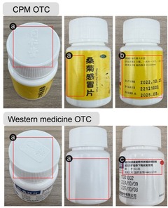
CPMs and Western OTC medicines differ significantly in visual design, labelling practices and cultural positioning (see Table 1). CPM packaging often incorporates traditional imagery, herbal illustrations, calligraphic fonts and traditional Chinese medication references, but frequently lacks clear dosage information (Lu and Abd Jamil, 2024). In contrast, Western OTC products sold in China typically follow standardised international design norms, including high-contrast fonts, structured panels and simplified biomedical terms. These differences affect older adults’ ability to understand medication information: CPMs impose greater cognitive demands due to dense layouts and cultural symbols, while Western OTCs are generally clearer. Nevertheless, both present readability challenges for older users in real-world settings.

Design issues identified in CPM and Western OTCs in China
A previous study on the quality and readability of OTC medication packaging in China demonstrated the need for more comprehensive and informative instructions on proper drug use (Zheng et al., 2022). Conventional information design strategies typically fail to meet the needs of older adults: Poorly written patient information affects readability, usability and usefulness (Raynor et al., 2007) and many scholars have noted design flaws, such as small text due to limited space and difficult pictograms that make it difficult for older adults to easily understand medication information (Koo et al., 2003; Ishihara et al., 2004). Ng et al. (2017) examined how medication pictograms help older adults understand drug information. However, previous studies have not offered concrete recommendations for packaging design and the relationship between older adults’ recognition of medication information and their daily medication management remains underexplored. This gap in our understanding of how older adults’ real-life processing of medication information hinders the discovery of effective solutions. Examining older adults’ self-management behaviours and how they identify crucial drug packaging information may aid in developing interventions targeting medication safety. Moreover, as many older adults, especially those in remote areas or with few resources, struggle with using digital interfaces, solutions are needed that do not require Internet access or smart devices.
3. Methods
3. 1. Study Design
This study employed in-depth interviews to explore the medication behaviours of older adults, focusing on their use of OTC medicines, perceptions of medication labelling and understanding of relevant information. The aim was to capture insights from the user’s perspective, emphasising their unique needs and experiences (Crabtree et al., 2003). The study took place in Chaozhou City, Guangdong Province, China, which was chosen for its demographic challenges, such as significant youth emigration, an ageing population and an underdeveloped care system for older patients and its limited healthcare resources led us to expect that this study would yield broadly applicable findings. The target group consisted of adults aged over 60. Exclusion criteria included older adults with severe visual, hearing or cognitive impairments that could hinder meaningful participation. Participants were selected to ensure diversity by reflecting a range of OTC medication use, information recognition, and behavioural experiences. Potential participants were informed about the study’s purpose and their informed consent was obtained before the face-to-face interviews. We employed qualitative content analysis (Krippendorff, 2019, 1984) to identify older adults’ particular medication management experiences and challenges.
3. 2. Data Collection
After an approval of ethics from our institutional review board(KMU-202307-HR-369), we conducted interviews with 15 older adults (average age 69; 7 males and 8 females) in either Mandarin Chinese or Teochew, based on participants’ language preferences, between October and November 2023 (see Table 2). All received a tea gift set (valued at RMB 200) as compensation. Each interview lasted 40–45 minutes and was recorded and then transcribed and translated into English for analysis.
Participants’ demographic information
The interview questions, both open and close-ended, were organised into five sections (see Table 3). The first section collected demographic data, including age, sex, family type, health status and vision. The second section elicited details on participants’ daily routines. The third section presented a case study to assess OTC medication use and sources. The fourth section focused on medication information and challenges, while the fifth section elicited participants’ opinions about the design of medication information, particularly packaging and instructions. Photographs of medication packaging, pillboxes and areas where participants had difficulty identifying medication information were taken for insight into daily medication management and storage.
Outline of the interview
3. 3. Data Analysis
We employed Braun and Clarke’s (2006) six-step thematic analysis. Textual data and brief image descriptions were first organised in a spreadsheet for independent evaluation and coding. Multiple rounds of discussion enabled the research team to summarise key themes and identify coding descriptors. Verbatim interview notes were transcribed, translated and imported into NVivo for data management. Each transcript was reviewed at least once to ensure familiarity and the data were systematically categorised and coded for emerging themes.
4. Results
Participants exhibited high adherence to instructions and vigilance when taking multiple OTC medications. All participants reported using more than one OTC medication, taking measures to avoid confusion and relying on the written instructions on the packaging or paper inserts. All but one participant consulted these written resources to distinguish medications and despite vision impairments, they were able read the instructions independently with glasses. These findings highlight the need to optimise OTC packaging design to suit older adults’ cognitive abilities and medication habits to ensure safety and convenience. The themes and sub-themes identified in the analysis are presented in Table 4.
Themes and sub-themes
4. 1. How Older Adults Manage OTC Medicine
Most participants facilitated accurate and safe medication administration by integrating their medication routines into their daily lives. In particular, P4, P5, and P11 utilised visual or habitual cues to take medication during their daily routines. For example, P4 aligned her medication administration with her morning tea habit. She placed her medications on the tea tray to remind herself to take them, reducing the likelihood of missed doses: “I would put all the medications for the day next to the tea tray on the coffee table so that I would see them while having tea.”
Participants also employed coloured caps to distinguish medications and optimised their strategies over time. P13 transitioned from dispensing daily doses to organising his pills weekly, using the full and empty bottles to track what he had taken: “I now fill pill bottles for the week and store them in a drawer. The bottles on the left contain medication, and those on the right are the empty ones that I have already administered.”
The participants’ behaviour showed that placing medications in prominent locations served as effective reminders. Because their daily routine included tea consumption, P3, P4, P5, P8, and P10 placed their medication near where they made tea to ensure timely administration. P8: “I come here for a cup of tea first thing in the morning after waking up, seeing the pillbox, it reminds me to take my medication (see Figure 1).” P6, P7, and P11 opted to place their medication on their kitchen table; as they spent the most time there, this made it a natural, conspicuous location for reminders.
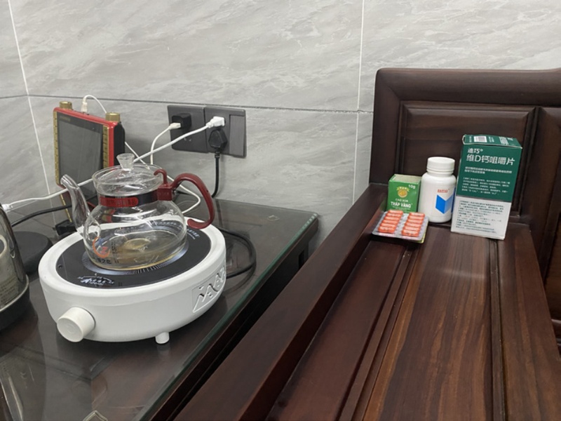
P8’s medication placed in a frequently accessed area as a reminder
Some participants (P2, P10, P14, and P15) who self-medicated for minor illnesses accessed WeChat and Baidu for medication information, highlighting how self-pharmacotherapy has become an important aspect of self-management for older adults. Many participants also used online resources to find appropriate medications for minor health issues.
Family members, particularly adult offspring, are vital to older adults’ daily lives and health management, especially those with limited mobility or complex medical needs. Half of the participants (P1, P8, P9, P10, P11, P12, and P13) relied on their children to purchase OTC medications. For instance, because of his educational level, P1 relied on his daughter to purchase medications. P1: “My daughter helps me purchase all the OTC medications that I administer.”
In addition, family members assisted with reading instructions, confirming dosages and monitoring supplies. P1 and P8 said their daughters helped them with medication management. P1: “She can help me confirm the correct medication dosage and administration.” Many participants’ children helped maintain medication adherence and reduced the risk of forgetfulness by checking their parents’ medication supply and regularly reminding them to take their medicine. P9: “I would remember to take my medication only when my daughter asks if I have forgotten to administer my medication.”
Older adults often sought advice on minor ailments and medications from trusted local community clinics, whose proximity allowed the participants (except P6 and P7) to have more frequent follow-up consultations, ensuring prompt professional healthcare support. These older adults purchase OTC medications based on previous prescriptions without consulting the doctors again and many participants (P3, P4, and P10) followed the instructions or labelling on the medication. P3: “My OTC medication is based on my doctor’s previous prescription. After administering it, I simply purchase more based on their earlier advice. I do not consult my doctor again for a second purchase.”
Thus, many participants trusted their doctors’ medication information and followed the medication lists they provided, adhering strictly to the recommended dosages and timings.
4. 2. Challenges in Medicine Package Design
Participants reported multiple design-related barriers concerning legibility, health literacy and readability (see Table 5). These issues highlight the need for pharmaceutical packaging that better meets older adults’ needs.
Challenges in medication package design and their cause
Participants noted the small font sizes on medication packaging, including the outer boxes, instructions, and vial labels. Space limitations on packaging often make it difficult to present essential information in a readable format, which poses a significant challenge for older adults with visual impairments. Several participants (P1, P6, P9, P10, P11, P12, P13, P14, and P15) had trouble reading the indications, contraindications, dosage, and expiry dates, all information that must be clearly legible for safe and accurate medication use. P5 would take pictures to magnify the information: “I will take a picture and enlarge the image to view the information. If the font is too small, it will appear blurry even if a picture is enlarged. There are cylindrical pill bottles, which are difficult to photograph entirely.” Despite this solution to the issue of the small font, insurmountable difficulties remained.
Many participants (P1, P3, P4, P8, P9, P12, and P14) reported difficulties in recognising the date of manufacture and expiry on medication packaging, especially when these details were printed using steel stamps (see Figure 2). Participants expressed concern about purchasing expired medications due to this lack of clarity. P3 noted that poor lighting in pharmacies made printed dates harder to read: “When I ask pharmacy staff, I am concerned they may not provide accurate information and sell medications close to expiry.”
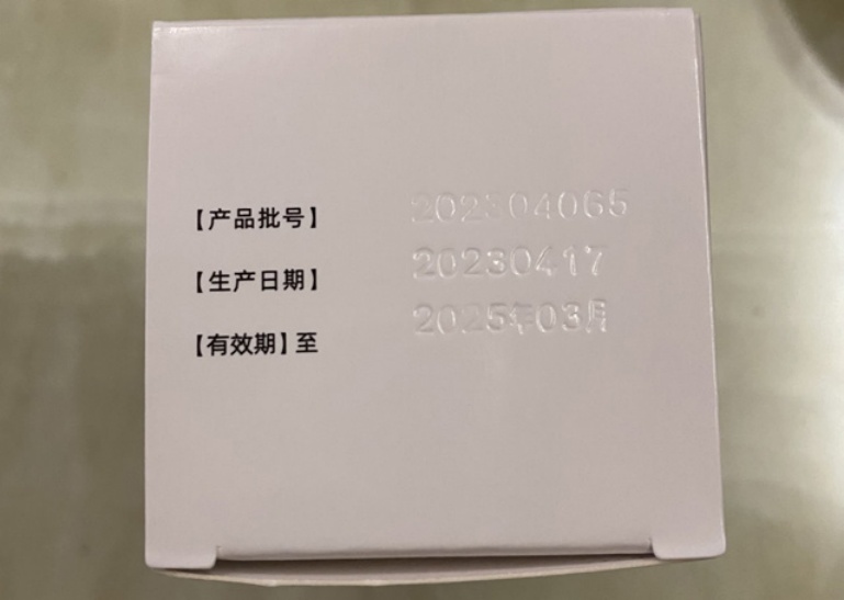
The expiration date of the steel stamp on a glossy box is not clearly visible
Several participants (P1, P2, P3, P14, and P15) reported difficulties understanding the labelling and textual information on drug packaging. Drug dosage and administration instructions were often difficult to find and had poor visibility. Moreover, when the outer packaging is lost, identifying the medication information on the medicine bottle is even more difficult for many participants (P1, P3, P5, P12, P14, and P15).
Older adults, particularly those without a medical background, often face difficulties understanding complex medical terminology. Most participants (except for P6, P7, and P13) were confused by unfamiliar medical terms on drug labels. Participants noted that chemical terms or specific medical jargon were hard to understand. P1: “I cannot understand the name Finasteride tablets.” Participants suggested clearer, more intuitive labels in drug packaging to facilitate identification and use. P11: “It would be better if there were special labels on it, such as headache, for toothache, and diarrhoea.”
Additionally, participants had difficulty understanding foreign language labels. Three participants (P2, P12, and P14) often needed to rely on family members or translation tools for assistance. P12: “I can not read labels of some medicines as they are in foreign languages. I then ask my son or daughter-in-law.”
Three participants (P10, P11, and P13) indicated that many decorative patterns on the medication packaging were unnecessary and occasionally obscured essential information. They noted that unnecessary design features occupied space that could be used for clearer drug information. P10: “The packaging contains so much information and decoration that some important drug information cannot even be read.”
However, several participants (P3, P4, P7, P8, and P14) relied heavily on visual cues, including package colours, symbols or images, to identify the type of medication or its intended use. For instance, P3 used the sizes of the medicine bottles as a visual cue, while P4 relied on their colour and shape to identify which medications to take at particular times. P4: “The long package and the green one lower blood pressure; the biggest one lowers blood lipids.” P14, who encountered health products with instructions in foreign languages, used the graphics and colours to recognise her medications: “I just looked at the surface of the package, and there was a row of little fish on the surface of the package, [...] thus, I knew that this one was a fish oil.”
P14 highlighted the usefulness of graphics on packaging in providing visual information about a medication’s intended use. She described how she recognised an ointment from the body acupuncture points printed on it, which helped her understand its application even when the packaging had been discarded (see Figure 3): “This one is an applicator ointment that my son bought from Korea (right); it has the body acupuncture points printed on it, [...] if its outer packaging is lost, I will know its efficacy and how to use it.” These findings emphasise the importance of clear and meaningful graphics and the overall readability of drug packaging for older adults. Visual cues can help older adults identify medications, especially when faced with language or terminology barriers.
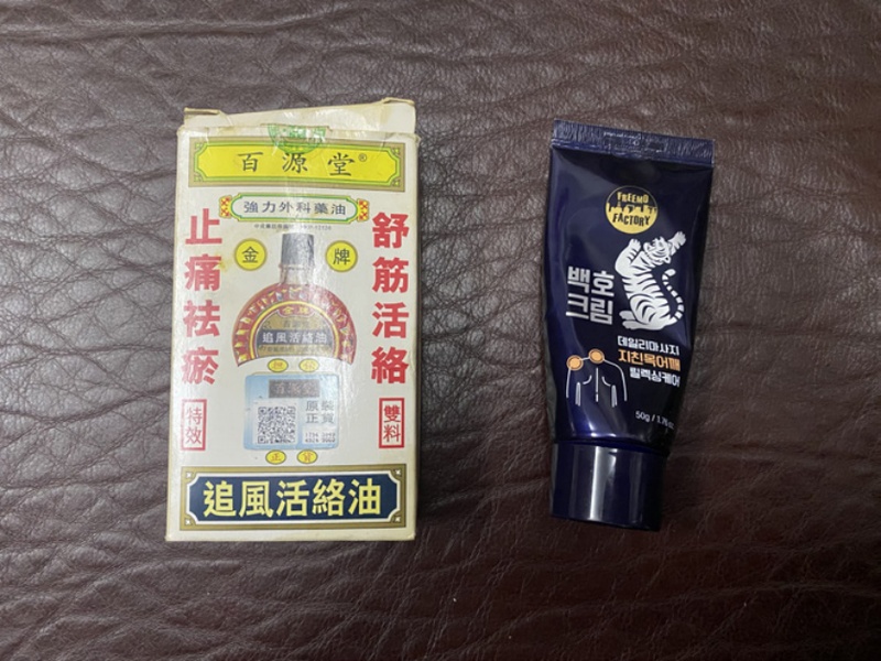
The two packages that P14 compared
5. Discussion
This study examined how older adults manage OTC medications and the challenges they encounter. The findings reveal their strategies, behaviours and needs and offer insight for improved domestic medication management and packaging design.
5. 1. OTC Drug Management Constraints in the Domestic Setting
Older adults demonstrated autonomy in managing OTC medications by integrating them into their daily routines, including drinking tea, walking or cooking, thereby enhancing adherence and minimising errors. Colour-coded caps, bottle size and pictorial cues further supported rapid recognition under conditions of limited attentional resources. This reflects their adaptability and use of previous experiences and problem-solving abilities to overcome challenges (Xiao et al., 2023). However, these strategies require legible text and unambiguous graphics. Illegible expiry dates, crowded layouts or unfamiliar terminology break the perception–action loop, forcing users to engage in effortful reading or ask their family for assistance. Older adults often photograph the labels on cylindrical vials to magnify the text, but such text is easily distorted when photographed. Hence, packaging for which first-glance identification fails imposes a cognitive overload precisely where older adults seek to conserve effort.
Thus, we suggest the following design strategies:
- • Provide instantly perceptible ‘recognition keys’ (e.g. high-contrast colour bands for time of day, tactile icons for dosage), allowing users to link medicines to routine anchors without having to decode small print.
- • Position critical text so that it remains visible when bottles sit upright on trays or tables.
- • Design the labels on cylindrical bottles to display all critical information within a single flat viewing panel for one-glance reading while being undistorted when photographed with a smartphone.
Family members, especially adult children, play a crucial role in helping older adults manage their medications by providing reminders, reading instructions and obtaining medications. In our study, half of the participants depended on adult children to purchase their medicine or remind them to take it and nearly all of them trusted the advice they had previously received from local clinicians. Trust in healthcare providers affects older adults’ medication adherence, as many of them continue to buy OTC medications based on earlier prescriptions. In the rural area where our study was conducted, pharmacies are often close to patients’ residences and communicate with patients’ family members upon request. Therefore, packaging should be designed so as to support distributed care work. Participants frequently used video calls or texts to communicate with their family members living at a distance for assistance with their medication. Additionally, although many of the caregivers are familiar with smart devices, some elderly patients find barriers to using the same technology. At the same time, many elderly individuals want to maintain their independence, as shown by participants who managed their medications on their own.
Thus, appropriate packaging design would aid to older users and intermittent helpers who may have various literacy levels or reside elsewhere. Accordingly, we suggest the following design strategies.
- • Encode dosage instructions in plain language and pictograms that family members can conveniently access remotely via video calls.
- • Print a scannable QR code linking to an audio-visual guide; this accommodates presbyopia and allows caregivers to verify instructions quickly.
- • Include writable zones on the bottles where helpers can mark custom reminders (e.g. ‘after breakfast’) once the outer cartons have been discarded.
Homes are visually and physically heterogeneous. Participants are notified of the expiration dates of their medicine in the pharmacy, but typically struggle to read the steel-stamped dates in dim kitchen lighting or shadowed corners.
Taking medication is a part of older adults’ everyday life, so the pill boxes and medicine bottles reside among other household items. At the same time, small packages are easily lost.
We found that older adults often place certain medications in a specific order where they can be easily found. Research on situated visibility indicates that information must remain readable under the actual luminance and orientation conditions of use. We suggest the following design strategies to overcome these constraints.
- • Use matte, low-glare substrates and dark-on-light typography with a minimum height ≥3 mm to preserve contrast in sub-optimal lighting.
- • Reserve sufficient space on the package faces most likely to be exposed on crowded shelves for the essential triad: drug name, purpose icon and expiry date.
5. 2. Design Proposal
In this section, we suggest a design exemplar that draws on the design recommendations we adduced from the challenges identified in our study. Our design proposal is aimed primarily for the medication packaging design industry, whose products significantly impact the health of elderly patients in China.
The prevalence of abstract terminology and dense textual instructions for CPMs underscores the need for intuitive visual cues. To address this challenge, this study proposes a packaging design concept that externalises human bodily features by presenting the treatment site for the drug in three-dimensional relief on the exterior of the medicine bottle (see Figure 4).
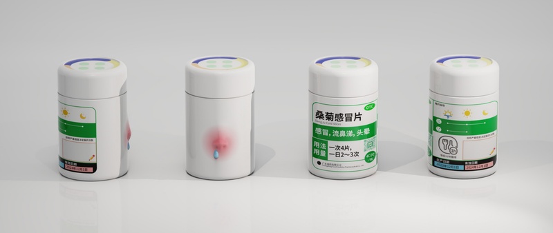
Prototype medicine bottle packaging design
The label area thus combines text with a model of the respective area of the body to reinforce the association between diseases, medications and body parts, thereby reducing the risk of errors due to difficulty in understanding the information. This strategy leverages visual-tactile associations to minimise reliance on text and support recognition among users with low literacy or visual impairments. It also preserves culturally relevant terminology for the body and health while simplifying its interpretation.
This study found that CPM labels often specify vague ranges for dosage frequency, creating uncertainty among elderly users. To translate this abstract information into actionable guidance, following Lin and Luo (2024) on the application of emojis in health information, we designed ‘emoji-style dosage frequency diagrams’ on the labels: Using two emotion icons—‘😖’ and ‘😐’—to represent different levels of physical discomfort, users are guided to select the appropriate dosage frequency based on their condition (e.g. ‘😖’ indicates severe discomfort requiring 3 doses daily, while ‘😐’ corresponds to 2 times daily). This approach bridges cultural symbolism and standardised visual communication by using emotive icons to convey the severity of symptoms and recommended dosing frequency, thereby enhancing comprehension and recall.
Limited information on vials remains a challenge even in standardised Western OTC packaging. This issue is even more pronounced for CPMs, where dense traditional labelling further restricts accessibility. To address this limitation, we propose a visual assistance system for medication time and dosage integrated into the bottle cap (see Figure 5) in which colour coding is used to distinguish medication times—yellow for morning, orange for noon and dark blue for evening. The number of circles in the centre corresponds to the number of tablets. Rather than replacing the instruction manual, this system functions as a compact embedded reminder that both optimises the use of the limited surface area of small CPM containers and compensates for the cognitive demands of dense text instructions, balancing regulatory requirements with the needs of elderly users.
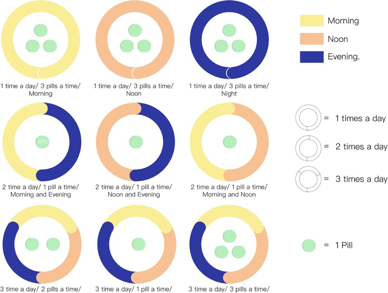
Color-coded cap design to enhance medication adherence
6. Conclusion
This study provides an in-depth analysis from a user perspective of the packaging barriers Chinese seniors face in using OTC medications. Despite the intervention of personalised medication and family assistance strategies, the packaging itself is a key factor in medication safety and adherence, underscoring the need for improved readability and legibility. This study proposes three innovative strategies based on multisensory and visual recognition: bottles with 3D reliefs of the place of application; emoji-based frequency cues and bottle cap dose visualisation; and graphic, colour, and structural optimisation to facilitate recognition. This study focused primarily on older users through interviews with individual seniors, while excluding perspectives from other stakeholders like middle-aged caregivers and pharmacists. This limits the applicability of the findings in multi-user contexts. Future research should include family caregivers and healthcare professionals for greater inclusivity. Through the clarification of the problems these interviews elicited, this study seeks to provide a concrete, visual and improvable design response by offering practical strategies for OTC packaging and hopes to expand the directions of multisensory, context-aware oriented pharmaceutical packaging research.
Acknowledgments
This research was supported by the “Regional Innovation System & Education (RISE)” through the Seoul RISE Center, funded by the Ministry of Education (MOE) and the Seoul Metropolitan Government. (2025-RISE-01-005-04)
This work was partially supported by the National Research Foundation of Korea Grant funded by the Korean Government(MSIT) (NRF-2022R1C1C1010883 and RS-2024-00407105). Also, this work was supported by the New Faculty Startup Fund from Seoul National University.
Notes
Copyright : This is an Open Access article distributed under the terms of the Creative Commons Attribution Non-Commercial License (http://creativecommons.org/licenses/by-nc/3.0/), which permits unrestricted educational and non-commercial use, provided the original work is properly cited.
References
-
Atkin, P. A., Finnegan, T. P., Ogle, S. J., & Shenfield, G. M. (1994). Functional Ability of Patients to Manage Medication Packaging: A Survey of Geriatric Inpatients. Age and Ageing, 23(2), 113-116.
[https://doi.org/10.1093/ageing/23.2.113]

-
Arditi, A., & Cho, J. (2005). Serifs and font legibility. Vision research, 45(23), 2926-2933.
[https://doi.org/10.1016/j.visres.2005.06.013]
-
Braun, V., & Clarke, V. (2006). Using Thematic Analysis in Psychology. Qualitative Research in Psychology, 3(2), 77-101.
[https://doi.org/10.1191/1478088706qp063oa]
-
Carli Lorenzini, G., & Hellström, D. (2017). Medication packaging and older patients: A systematic review. Packaging Technology and Science, 30(8), 525-558.
[https://doi.org/10.1002/pts.2241]
-
McMonnies, C. W. (1999). Chart construction and letter legibility/readability. Ophthalmic and Physiological Optics, 19(6), 498-506.
[https://doi.org/10.1016/S0275-5408(99)00015-0]
- Crabtree, A., Hemmings, T., Rodden, T., Cheverst, K., Clarke, K., Dewsbury, G., ... & Rouncefield, M. (2003, November). Designing with care: Adapting cultural probes to inform design in sensitive settings. In Proceedings of the 2004 Australasian Conference on Computer-Human Interaction (OZCHI2004) (pp. 4-13). Brisbane: Ergonomics Society of Australia.
-
Drumond, N., van Riet-Nales, D. A., Karapinar-Çarkit, F., & Stegemann, S. (2017). Patients' appropriateness, acceptability, usability and preferences for pharmaceutical preparations: Results from a literature review on clinical evidence. International journal of pharmaceutics, 521(1-2), 294-305.
[https://doi.org/10.1016/j.ijpharm.2017.02.029]
-
Esmay, J. B., & Wertheimer, A. I. (1979). A review of over-the-counter drug therapy. Journal of community health, 5(1), 54-66.
[https://doi.org/10.1007/BF01321571]
-
Fayyad, M., Hassanein, M., Al-Hiari, A. I., Othman, A. M., & Abduelkarem, A. R. (2023). Consumer Medication Information: Legislative Gap and Challenges of Practice. Pharmacy Practice, 21(3), 2830.
[https://doi.org/10.18549/PharmPract.2023.3.2830]
-
Hall, L. M., & O'Lenic, K. (2012). Treatment strategies to overcome end-of-dose failure with oral and transdermal opioids. Journal of Pharmacy Practice, 25(5), 503-509.
[https://doi.org/10.1177/0897190010379719]
-
Ishihara, K., Ishihara, S., Nagamachi, M., Osaki, H., & Hiramatsu, S. (2004). Independence of older adults in performing instrumental activities of daily living (IADLs) and the relation of this performance to visual abilities. Theoretical Issues in Ergonomics Science, 5(3), 198-213.
[https://doi.org/10.1080/1463922021000050023]
- Lin, T. S., & Luo, Y. (2024). Visual-textual integration: Emoji as a supplement in health information design. International Journal of Design, 18(2), 37-58. https://ijdesign.org/index.php/IJDesign/article/view/5439/1069.
-
Kim, J. H., Kwong, E. M., Chung, V. C., Lee, J. C., Wong, T., & Goggins, W. B. (2013). Acute adverse events from over-the-counter Chinese herbal medicines: a population-based survey of Hong Kong Chinese. BMC Complementary and Alternative Medicine, 13(1), 336.
[https://doi.org/10.1186/1472-6882-13-336]
-
Koo, M. M., Krass, I., & Aslani, P. (2003). Factors influencing consumer use of written drug information. Annals of Pharmacotherapy, 37(2), 259-267.
[https://doi.org/10.1177/106002800303700218]
-
Klare, G. R. (1974). Assessing readability. Reading research quarterly, 62-102.
[https://doi.org/10.2307/747086]
-
Lockhart, H., & Paine, F. A. (1996). Packaging of pharmaceuticals and healthcare products. Springer Science & Business Media.
[https://doi.org/10.1007/978-1-4615-2125-9]
-
Lu, G., & Abd Jamil, A. B. (2024). Research on Graphic Elements of Chinese Herbal Medicine Packaging from the Perspective of Consumer Perception: An Empirical Study from China. INTERNATIONAL JOURNAL OF ACADEMIC RESEARCH IN BUSINESS AND SOCIAL SCIENCES, 14(11), 2000-2010.
[https://doi.org/10.6007/IJARBSS/v14-i11/23485]
-
Messina, R., Becker, R., van Riet-Nales, D. A., & Stegemann, S. (2015). Results from a preliminary review of scientific evidence for appropriateness of preparations, dosage forms and other product design elements for older adult patients. International Journal of Pharmaceutics, 478(2), 822-828.
[https://doi.org/10.1016/j.ijpharm.2014.10.052]
-
Ng, A. W., Chan, A. H., & Ho, V. W. (2017). Comprehension by older people of medication information with or without supplementary pharmaceutical pictograms. Applied ergonomics, 58, 167-175.
[https://doi.org/10.1016/j.apergo.2016.06.005]
-
Raynor, D. K. T., Blenkinsopp, A., Knapp, P. R., Grime, J., Nicolson, D. J., Pollock, K., ... & Spoor, P. A. (2007). A systematic review of quantitative and qualitative research on the role and effectiveness of written information available to patients about individual medicines. Health Technology Assessment, 11(5), 1-177.
[https://doi.org/10.3310/hta11050]
-
Rowson, J., Sangrar, A., Rodriguez-Falcon, E., Bell, A. F., Walton, K. A., Yoxall, A., & Kamat, S. R. (2014). Rating accessibility of packaging: a medical packaging example. Packaging Technology and Science, 27(7), 577-589.
[https://doi.org/10.1002/pts.2049]
-
Wilke, T., Müller, S., Neumann, K., & Loder, T. (2011). Does package design matter for patients? The association between package design and patients' drug knowledge. Pharmaceutical Medicine, 25(5), 307-317.
[https://doi.org/10.1007/BF03256873]
-
Krippendorff, K. (2019). Content analysis. SAGE Publications, Inc.
[https://doi.org/10.4135/9781071878781]
-
Sudbury-Riley, L. (2014). Unwrapping senior consumers' packaging experiences. Marketing Intelligence & Planning, 32(6), 666-686.
[https://doi.org/10.1108/MIP-02-2013-0027]
-
Swanlund, S. L. (2010). Successful cardiovascular medication management processes as perceived by community-dwelling adults over age 74. Applied nursing research, 23(1), 22-29.
[https://doi.org/10.1016/j.apnr.2008.03.005]
-
Tong, V., Raynor, D. K., & Aslani, P. (2014). Design and comprehensibility of over-the-counter product labels and leaflets: a narrative review. International Journal of Clinical Pharmacy, 36(5), 865-872.
[https://doi.org/10.1007/s11096-014-9975-0]
-
Tong, V., Raynor, D. K., & Aslani, P. (2018). Developing alternative over-the-counter medicine label formats: How do they compare when evaluated by consumers?. Research in Social and Administrative Pharmacy, 14(3), 248-261.
[https://doi.org/10.1016/j.sapharm.2017.03.003]
-
Xiao, Y. M., Huang, D. H., & Lin, R. T. (2023). Integrating elder and youth into co-design approach-A case study of medication aids design. Creative Education, 14(10), 1914-1944.
[https://doi.org/10.4236/ce.2023.1410123]
-
Zheng, Y., Tang, Y., Tseng, H. C., Chang, T. H., Li, L., Chen, P., ... & Tang, K. J. (2022). Evaluation of quality and readability of over-the-counter medication package inserts. Research in Social and Administrative Pharmacy, 18(9), 3560-3567.
[https://doi.org/10.1016/j.sapharm.2022.03.012]